Flat UI
- By
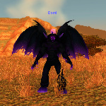
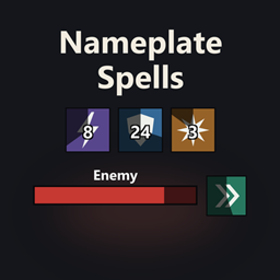
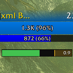
Restyles the default interface in WoW: Forever with thin dark borders and flat bars, and adds an options window, profiles, movers for frames and windows, buff trackers and numbers in front of enemy nameplates.
Flat UI restyles the default interface in WoW: Forever with thin dark borders, flat backgrounds and flat bar fills. It has its own options window, profiles that export and import as one line of text, handles for moving and sizing frames and windows, and combat numbers drawn in front of enemy nameplates and over friendly units.
What it does
Flat UI
- Borders: a border of 1 to 3 pixels just outside each framed element, black by default (Border thickness, Border colour). One pixel is one screen pixel at any UI scale.
- Backgrounds: Background colour and Background opacity set the fill behind framed elements. Default is near black at 85%.
- Borderless: removes borders in the general border colour. Threat, Elite and Rare, debuff type and item quality borders stay.
- Bar texture: Flat, Soft shade, Shaded, Gloss, Stripes, Bottom edge, Side fade, Game status bar, Skills bar or Targeting bar, used on every bar that has a flat fill.
- Custom UI scale: sets the game's own UI scale from 65% to 115%, with Custom scale. Scale below 65% and Small scale (35 to 64%) go under the game's slider; the game can refuse presses of its own action buttons at those sizes. Turning Custom UI scale off puts back the scale the game had before, also after a
/reloador a profile switch. A change to the scale says "/reload to finish." in the status. - Cast colours: five colours for cast, channel, uninterruptible, interrupted and crafting casts, shared by cast bars, nameplate cast bars and breath and fatigue timers.
- Border colour source: on the Colours page, Border colour on the Flat UI page (the default), Your class colour or Your faction colour. It applies to square edges. The round portrait rim, the minimap ring, the Defensives on you icons and the window dividers stay at Border colour.
- Custom reaction colours: off by default. Hostile, Neutral, Friendly and Tapped by another player colour the unit frames that colour by reaction, except the target and focus name rows and nameplates.
- Custom power colours: off by default. Mana, Rage, Energy, Focus and Runic power.
Nameplates
- Health bar: a thin border, a dark background and one flat fill in place of the game's thick band and gloss. Height from 50% to 200%.
- Target and focus: a white border on your target and an orange one on your focus, 1 to 4 pixels, both colours settable.
- Elite, Rare and Boss: Mark after the level adds + after an Elite level, R after a Rare and R+ after a Rare Elite. Border colour for Elite and Rare is gold for Elite, silver for Rare and red for Boss.
- Class icons: beside the health bar on enemy players, and on friendly players if turned on, at Left, Right, Above or Below.
- Cast bar and auras: a thin-bordered flat cast bar with its own Cast bar texture (Same as the Flat UI page by default), and square aura icons with a thin border.
- Text: sizes for the name, health text and level, a Level box of Thin border, Text only or Default, and a Fading row behind the name, off by default.
Combat text
- Place combat numbers: the page switch, on by default.
- Numbers over enemies: In front of nameplates draws each hit on an enemy as a number over its nameplate, in front of it. As the game has them keeps the game's own numbers, which draw behind nameplates and show only your and your pet's hits.
- Whose hits: with In front of nameplates, Yours and your pet's (the default) leaves out other players' damage, or Everyone's shows every hit. The game names no source for a hit, so Flat UI follows your casts, swings and auras. Hits before your first cast or swing are left out. If 10 hits are reported in combat and none of your casts or swings has been heard, the game's own numbers come back. Where the game offers no cast event, the game's own numbers show.
- Kind of hit: Kind of hit in parentheses puts Glancing, Crushing, Block, Resist or Absorb after the amount when the game reports it, as in 412 (Glancing). A hit that does nothing shows one word in white: Miss, Dodge, Parry, Block, Resist, Absorb, Immune, Evade, Deflect, Reflect or Interrupt.
- Colours: physical hits are white, hits of other schools yellow and healing green. Colour by school of magic, off by default, colours Holy, Fire, Nature, Frost, Shadow and Arcane. A critical or crushing hit over an enemy is a fifth larger than other numbers.
- Position and size: Height above the enemy from 0 to 100, 60 by default. Critical hits at Same height or Higher. Size from 40% to 400%, 140% by default. Above 160% the numbers rise, fall and spread in proportion to their size, and a critical hit swells to at most 128 units.
- Spread and movement: Spread is Tight or Loose. Spread width, 50% to 300% and 100% by default, widens where numbers start and is used with Loose. Movement is Rise and fall or Straight up. Loose and Rise and fall are the defaults.
- Overlapping numbers: Keep apart (the default) starts a number in a free lane, or higher up, so numbers stop covering each other. Stay in turn starts each number where the last one started. Rows, 1 to 6 and 4 by default, limits how many rows a number may start up.
- Style: Flat UI (the default) or Classic. Classic is the game's old floating text. Numbers climb straight up at a steady speed and last 1.9 seconds. They stack in a column and go to the side past Rows. A critical hit pops, then stays in place. Colours is White and yellow or Red and purple. Further rows: Plus and minus signs over enemies, Smaller glancing hits and words, Rise distance, Time on screen, Stacking (Older numbers move up or New numbers start lower) and Critical hits stay in place. How a number appears and Movement apply to Flat UI only. Numbers over friendly units take the style too.
- Enemies: Every enemy with a nameplate, or Target only.
- Game's own numbers: while Place combat numbers is on, the height, size, spread and movement settings also set the game's own numbers, under both choices of Numbers over enemies. These are game settings that Flat UI writes and puts back.
- Look: Font is Friz Quadrata (the game's damage font, the default), Arial Narrow, Skurri or Morpheus. Outline is Thick, Thin or None, None by default. Shadow is off by default. How a number appears is With a pop, larger for critical hits (the default) or Plainly. With a pop a number swells for a fifth of a second, and a critical hit starts a fifth larger and swells to twice that size. These apply to the numbers in front of nameplates and to your own text. Numbers the game draws itself, which are every number with As the game has them and the healing you do, keep the game's look. When the game refuses a font,
/flatui statussays which look is shown. - Your character: Combat text for you is Damage and healing you take, Also misses, dodges and gains (the default) or Off. Damage is -412 in red, purple for magic, and healing is +300 in green. Also misses, dodges and gains adds Miss, Dodge, Parry, Block, Resist, Absorb and the like, and gains such as +20. Movement of your text is Up (the default), Down or In an arc. Size of your text is 40% to 400%, 100% by default.
- Your text and the game's: while Combat text for you is not Off, the game's Scrolling Combat Text for Self is off. Its other messages do not show: auras, spell alerts, reputation, honor, combo points, low health, low mana and entering or leaving combat. A heal you cast on yourself can show twice.
- Friendly units: Where friendly numbers show is Off, Party and raid frames, Friendly nameplates or Both (the default). Numbers over party, raid and pet frames draw above the frame. Friendly units is Every friendly unit or Target only. Damage friendly units take is on by default. Healing over friendly units is Healing they take from anyone (the default), Healing you do or Off. Your pet, Misses and dodges over friendly units (off) and Plus and minus signs are switches. Friendly damage colour and Friendly healing colour are settable, Size over friendly units is 40% to 400% and Height above frames is 0 to 100, 10 by default. While friendly numbers show, the game's healing row is set to 0 and put back when they stop.
- Test:
/flatui combat testshows sample numbers for you, over your target and over friendly units.
Action bars
- Action buttons: Flat UI's (the default) or The game's. With Flat UI's, mouse clicks on the main bar and Action bars 2 to 8 go to Flat UI's own buttons, laid out where Edit Mode puts the game's bars and wearing the same look, and the game's eight bars stay in place and are not drawn. Key presses still go through the game's buttons, except keys bound to a slot that holds a flyout, which go to Flat UI's button. A reload applies it.
- Buttons: square icons with a thin border on the main bar, Action bars 2 to 8, the pet bar and the stance bar, with a switch for each group.
- Icon crop: trims the edge of every icon, 8% by default, 0% to 15%.
- Flat highlights: the pressed, hover, checked, equipped, spell highlight and attack flash states become flat tints over the icon.
- Main bar art: Hide bar frame, Hide end caps and Hide dividers remove the main action bar's frame art. They apply with The game's buttons.
- Glows and animations: Rotation helper highlight, Cast fill animation and Interrupt flash show on the game's buttons only.
Personal resource display
- Borders: a thin border and backdrop on the health, power and alternate power bars, one switch for each.
- Join bars: closes the gap between bars so neighbours share one border.
- Fill: a flat fill in the game's colour, or Health colour and Power colour when Custom health colour and Custom power colour are on.
- Text: Text size from 60% to 200%, and Health and power numbers on or off.
Swing timers
- Borders: a thin border on the main hand, off hand and ranged timers. Border around is Bar only or Whole timer.
- Fill: amber for main hand, blue for off hand and green for ranged, or your class colour on all three with Class colour.
- Spark and text: Spark, Text shadow, Timer name and Time left, with Text size from 60% to 200%.
Cast bars
- Borders: a thin border and flat backdrop on the player, pet, target and focus cast bars. The game's own border, background and drop shadow are hidden.
- Fill: a flat fill coloured by what the cast is doing, using the five colours on the Flat UI page.
- Custom sizes: a width and height for each of the four bars, off by default. The defaults are the game's sizes.
- Text: with Custom player cast bar size on, Player cast bar text puts the name As the game has it, Below the bar or Inside the bar. Text size scales the name on all four bars.
Cooldowns
- Cooldown icons: a row of flat square icons for spells you pick, with a dark sweep, countdown numbers and charge counts. The global cooldown does not start the sweep.
- Spells: pick with Add a spell and Remove a spell, or with
/flatui cooldown add. Up to 40 spells for each character. - Layout: Icon size, Spacing, Icons per row, Row direction and Extra rows. Position is the middle of the screen or under the personal resource display, and the row can be dragged with Movers.
- Sound when ready: off by default. Plays a sound once when a spell on the Cooldown icons row is ready again, not for the global cooldown. The sound is the Sound chosen on the Low and missing page of Trackers: Raid warning, Alarm or Whisper warning. Where the game withholds a spell's cooldown in a fight, that spell's sound is skipped.
- Cooldown manager icons: the icons of the game's cooldown manager become square with a thin border and a square sweep.
Trackers
- Trackers: the page switch, on by default. A tracker is an icon for a buff on your character, with its charges, the time left and a thin border.
- Buffs: pick with Add a buff and Remove a tracker. A buff by name or spell ID goes in with
/flatui tracker add. - Weapon enchants: Add a check has Main hand enchant, Off hand enchant and Ranged enchant. A weapon tracker shows the enchant's icon with the time left and the charges, goes red and shows Missing when the weapon has no enchant, and is low under Low at (charges) and Low at (seconds left). Shaman imbues, rogue poisons, sharpening stones and oils all count.
/flatui tracker add weapon main(orofforranged) adds one. Weapon trackers keep working in fights, battlegrounds and arenas. A tracker for an off hand with no weapon is a grey icon. - Totems and pet: Add a check has Fire totem, Earth totem, Water totem, Air totem and Pet.
/flatui tracker add totem fire(orearth,water,air) and/flatui tracker add petdo the same. A totem tracker shows the icon with the time left, goes red when the slot is empty and is low under Low at (seconds left), and the sound plays when a totem ends. In a fight where the game hides a totem, the tracker is drawn with the game's own timer calls; if the game refuses one, that part is left out and/flatui tracker checksays which. A pet tracker goes red when you have no pet or it is dead./flatui tracker set 1 happy onmakes a hunter's pet tracker low while the pet is unhappy. - Items, ammunition, tracking and forms: Add an item lists the items in your bags. An item tracker shows the icon with the count in your bags, red at 0, low under Item minimum (1), with the item's cooldown as a sweep. Add a check has Ammunition, low at Ammunition minimum (200) or under and fine on a character that uses none, and Tracking, fine while any minimap tracking is on and red when none is. Add a stance or form lists your forms; the tracker is fine in a listed form and red in none.
/flatui tracker add item,ammo,trackingandformdo the same./flatui tracker set 1 lowgoes up to 1000 for an item and 2000 for ammunition. All four work in fights. - Hide while mounted (on) and Hide in cities and inns (off): apply to trackers set to Only when low or missing.
- Look: the Tracker look page. Icon size from 16 to 64, 36 by default. Time left on or off. Row direction is From the middle (the default), Left to right or Right to left. Spacing sets the gap between icons, 3 by default. Show on the Trackers page is Always, Only when low or missing or Only in combat.
- Shape: on Tracker look, Shape is Icon (the default), Bar or Text. A bar shows the name, the charges and the time left over a flat fill; Text shows them on a dark plate. Bar width from 60 to 300 (140 by default), Bar height from 8 to 30 (14 by default, also the height of text), Bar fill is Charges (the default) or Time left, Colour and the switches Charges and Name. Low and missing turn the bar fill or the text red, and the missing word and pulse work on bars and text. A tracker can have its own shape and colour:
/flatui tracker set 1 shape bar,/flatui tracker set 1 colour 4d99e6. - Low and missing: the Low and missing page. Low at (charges) from 0 to 20, 1 by default, and Low at (seconds left) from 0 to 300, 0 by default, put a red rim on the icon. 0 means never. When missing is Red icon, Red icon that pulses or Red icon and the word Missing. Sound when it drops is off by default. Sound is Raid warning (the default), Alarm or Whisper warning. The sound for a buff or debuff ending is the game's own, so it plays in a fight where the buff is hidden; where the game refuses it, the tracker plays its own sound for drops it can read.
- Position: Place is Personal resource display (the default), Beside the character or Own position, with X offset and Y offset from -800 to 800. Side of the personal resource display is Above (the default) or Below; Below goes under the Cooldown icons row when that row hangs from the personal resource display. Trackers with different places make one row each. The row can be dragged with Movers (the Trackers handle).
- In fights: when the game hides buff charges and time left, Game's own icon in fights (on by default) shows the game's own icon in the same place. A Bar tracker shows the game's own bar for the buff, filled by the time left, or by the charges when Bar fill is Charges. A Text tracker shows the game's own count and time left. Low at (charges) and Low at (seconds left) turn the digit and the time red as they do on an icon. If the game refuses the bar, the tracker shows the last known fill in fights. Off, charges and time left stop updating in a fight. In fights without the game's icon is Last known (the default) or Hidden.
Defensives on you
- Defensives on you: the page switch, on by default. A row of icons for the shields, wards and protections other players cast on you, each with its time left, its charges and, with Caster's name on (the default), the caster's name. The list holds 56 buffs, Earth Shield among them. Icon size 32, spacing 3, at most 6 listed and 4 external icons; these are not settings.
- Place: Above the player frame (the default), At the personal resource display, Own position (drag the handle Defensives on you in
/flatui move) or Off. - In fights: the game draws the icons, so they should show in fights, dungeons, raids and battlegrounds. Where the game will not make its icon row, the icons show out of combat only, and
/flatui statussays so. - Your own defensives: off by default. Shows the defensives you cast on yourself, such as Shield Wall and Ice Barrier, in a group of up to 4 icons. Where the game makes no icon row, the switch is off and
/flatui statussays so. - Add a spell and Remove a spell: lists on the page that change which buffs the row shows, up to 40 added spells, kept for the account.
/flatui defensives addtakes a spell ID or a shift-clicked spell,/flatui defensives removea spell ID or a name, and/flatui defensives listprints them. - Commands:
/flatui testshows three sample icons for 8 seconds and says whether the sweep ended on each and whether the sound played./flatui checkprints whether the names and classes of the target and party1 can be read, whether addon messages pass, and whether the game shows who interrupted your last cast./flatui check lastprints the last check.
Party cooldowns
- Icons: beside each party member's frame, ready cooldowns bright and used ones dark with the time left. Party icons puts them right, left or below each frame, Show is Always, used ones dark (the default) or Only while on cooldown, Icons for each member is 3 to 8 (6 by default) and Icon size is 16 to 40 (24 by default).
- Abilities: Interrupts, Defensives and Defensives cast on others are on by default. Crowd control breaks and Group cooldowns are off.
- Your own row: off by default. Shows your own icons above the first member's while you are in a party.
- How it sees: a member's use of an ability is seen when the game shows his cast, and a defensive is seen when its buff can be read. A defensive cast on another member is tracked only where the caster of the buff can be read.
- Raid-style party frames: each member's row hangs from that member's frame, and your own row from your own frame.
- Raid group: your own row and your subgroup's rows stack in one place, each with the member's name. In a raid group is Own position (the default) or Off. The handle is Party cooldowns: raid group in
/flatui move. If the game gives no party1 to party4 in a raid,/flatui statussays the subgroup is read from the raid roster. Icons are placed out of combat only. - Add an ability and Hide an ability: lists on the page, up to 30 added by hand, each with a cooldown from 1 to 86400 seconds.
/flatui party addtakes an ability, a spell ID or a shift-clicked spell and its cooldown in seconds,/flatui party hidean ability or a spell ID, and/flatui party listshows the rows and which members share cooldowns. - Sharing: Share cooldowns with the party (on by default). A party member who also runs Flat UI sends his cooldowns, so his interrupts and defensives show used and ready on his row wherever the game lets addon messages through. When the game blocks addon messages,
/flatui statussays so in one line. - Commands:
/flatui testalso shows sample icons on each party row./flatui checkhas three more lines: party casts seen, party buffs read, and the caster of a party buff.
Enemy cooldowns
- Icons: up to four icons under the nameplate of each enemy player, with the time left. Icon size is 16 to 40 (24 by default) and Seconds on the icon is on by default.
- Abilities: Interrupts, Defensives, Crowd control breaks and Wards and immunities are on by default. Mobility and Offensive cooldowns are off.
- Border colour by kind: interrupts orange, defensives blue, wards and immunities white, crowd control breaks violet, mobility green, offensive cooldowns red.
- How it sees: casts and buffs of enemies are used where the game does not hide them. A kick that stops your own cast starts that player's kick timer. A timer that has started keeps counting and follows the player from plate to plate. Cooldown lengths are base values with talents not applied.
- Where it is off: where the game hides enemy casts and buffs,
/flatui statussays so in one line. - Commands:
/flatui testalso draws sample icons on enemy plates./flatui checkhas two more lines: Enemy casts seen and Enemy buffs read.
Fading
- Fade frames when idle: off by default. One switch each for the action bars (main bar and bars 2 to 8), the stance bar, the pet bar, the micro menu, the bag bar, the player frame, the pet frame and the minimap buttons.
- Look: Faded opacity 25%, Wait before fading 500 ms and Fade time 300 ms.
- Stays at full opacity: In combat (on) and With a target (off) keep the frames at full opacity. So do frames under the mouse, while something is on the cursor, while a spell flyout is open and in Edit Mode. Faded buttons still work. A bar in an active Bar block fades with that block's Fade the block.
Windows
- Which windows: 13 groups, each with its own switch, from Character to Collections, stable, sockets and other windows.
- Frames: window art is replaced by a flat box with a thin border at Window opacity, 80% by default. Button and slot colour and Highlight colour set the colours.
- Controls: buttons, tabs, side tabs, scroll bars, check boxes, text boxes and dropdowns, progress bars, right-click menus and list rows, each with its own switch.
- Side tab size: Game's size, Large, Medium or Small, Small by default. It sizes the tabs beside the Character, Inspect, Collections, Looking For Group, bank, Professions and Legacy windows and needs Side tabs.
- Clean up bags: Clean up bags button puts a small button with three bars In the title bar of the combined bag, each bag and the bank, or Under the slots, or None. It sorts with the game's own clean up. Also on the bank adds it to the bank, where it asks first while the game's bank question is on. Items gather is As the game sorts or From the other end, and also applies to the game's own clean up. There is no button in the gamepad interface style.
- Item slots: flat boxes with a border in the item's quality colour, and a red edge on a broken item.
- Hidden art: Show portrait, Show race background, Show talent backdrop, Show the eye and Show role button backgrounds bring pictures back. All are off by default. With Show the eye off, the eye in the Looking For Group window is fully invisible, its animations included, and takes no mouse.
Unit frames
- Frames: player, target, focus, pet, target of target, party, party pet, boss and raid frames each have a switch. The game's frame art goes transparent and thin borders go around the health and power bars. Raid cell look (on by default, Unit frames page, under Raid frames) makes the power bar on raid cells thin, with its own border, when Display Power Bars is on in the game's raid frame options, and turns the health bar grey for a dead or offline unit.
- Square portraits: a square picture beside the bars in place of the round portrait. The game's round mask is taken off its own portrait while the square picture shows, and taken off again if the game puts it back, so a portrait that shows through stays square.
- 3D head: a Picture choice that draws the unit's head as a model, framed by 3D head framing (Face, Head or Head and shoulders). It draws below the leader, PvP and raid target icons, level text and ready check. A unit out of view or an offline party member shows the picture.
- Portrait style: Picture (the default), Class icon or None. Class icon shows the class of a player. Other units keep their face, and so does a unit whose class the game withholds. None leaves the space empty.
- Portrait size: As tall as the frame (the default) or As tall as the bars.
- Portrait border: Thin (the default), Class or reaction colour or None. None draws no edges. Resting, combat and Elite colours still show.
- Portrait fades with the name row: on by default. The top of the picture fades into the background beside a name row that fades upward, so it changes how the player, target and focus pictures look. It is an overlay in the background colour, not true transparency, and matches only where the world behind is dark. It needs Name row colour set to Class or reaction colour, fading upward.
- Portrait switches: Player portrait, Target portrait, Focus portrait, Pet portrait, Target of target portrait, Party portraits and Party pet portraits, all on by default.
- Name row: on the player, target and focus frames, a row above the health bar with the name at the left and the level at the right, coloured by class or reaction (Name row colour, Name row fade).
- Name row on small frames: on by default. The pet, target of target, party and party pet frames get the same row above their bars, in the colour of the class or reaction of the unit, and the picture starts at the top of the row. Boss frames have the row with the level at its end and no picture. Turning the setting off removes the rows from the small frames; Name row still turns off every row. Level position covers the boss frames.
- Limits: the game withholds the class of some units in a fight, so a target of target can show a dark row until the game gives the class. A row does not repaint when a unit's reaction changes.
/flatui statusnames the name, picture, row size and row colour for the target of target, boss 1 and the first party frame. - Level: Level position is End of the name row (the default), Before the name, On the portrait (bottom right of the picture, with the Elite or Rare mark) or Hidden. Level colour is By difficulty, White or Same as the name. Level size is Same as the name, Smaller or Larger. The game's round level plate stays hidden in every position.
- Borders by state: Threat border, Resting and combat colour on the picture border, and Portrait border colour under Elite and Rare on All frames: bars and pictures, gold or silver on target and focus.
- Corners: Slightly soft or Soft rounds the name row, the bars and the border of each picture. The picture itself stays square. The default is Square.
- Text sizes: Health text size, Power text size and Small frame text size. Small frame text size, 70% by default, sizes the names and bar text on the pet, target of target, focus target, party and party pet frames.
- Smaller parts: Totem frame and Aura icon borders, with debuff icons bordered in the colour of their type.
- Pet frame size: Custom pet frame size sets the pet frame to a percent of the player frame (Player frame size) or of the normal size (Normal size), from 50% to 200% with Percent. It is off by default. While it is on, Edit Mode's pet Frame Size is not used. A change made in combat shows when combat ends. In
/flatui move, Ctrl and the wheel do not scale the pet frame. - Looks: a section of the Unit frames page with eight switches, all off by default: Health in class and reaction colour, Dark health bar, colour shows what is lost, Muted colours, White names (on frames with a name row), Smaller, lighter bar text, No text on the power bar, Soft shade on bars and Shadow behind each frame. All eight are off by default.
/flatui statusshows a Looks line only when a look could not apply, such as "class withheld on <frame>" in a restricted fight, where the bar keeps the Health colour.
Minimap and buffs
- Minimap: the ring and header are hidden and a thin border follows the map's shape. The zone name, tracking button and difficulty banner get borders too.
- Minimap in cities: some cities show a city map in the minimap. Flat round cover (the default) covers its square corners in the background colour and draws the thin border round the circle. The cover follows Border colour, Background colour, Border thickness, Borderless and Minimap border, and goes with the minimap when it is hidden. Game's ring while the city map shows brings the game's ring back only while the city map is up, and its corners may stay square. Leave as is leaves the city map as the game draws it.
- Buffs and debuffs: square icons with a thin border. A debuff border is blue for Magic, purple for Curse, brown for Disease, green for Poison and red for Bleed and untyped. Weapon enchants are purple.
- Experience and reputation bars: Experience bar is Flat UI's (the default) or The game's. With Flat UI's, Flat UI draws its own bar, from 10% to 130% of the game's full width (35% by default) and 2 to 24 pixels high (8 by default), and the game's bar stays in place and is not drawn. It shows experience with a stretch for how far rested experience reaches, and the faction you watch, coloured by standing (renown and paragon in blue). Both hide at the maximum level or with nothing watched. Width, Height, Bars shown, Top bar, Space between bars, Dividers, Experience colour, Rested experience, Rested colour, Reputation fill, Reputation colour, Bar text shows, Bar text place and Tooltip are its rows. The bar has a handle in Movers named Experience bar and starts centred over action bar 1. With The game's and Leave the game's action bars alone off, the bar has a thin border, a flat fill and no dividers.
- Buttons: square bag bar buttons and bordered micro menu buttons.
- Objective tracker and loot: flat tracker headers, bars and item buttons. The loot window and loot rolls get borders in the item's quality colour, and loot, money and honour alerts get a flat background.
- Timers and panels: breath and fatigue timers and countdown timers get a thin border and a flat fill. The queue status panel and zone event bars get a thin border, and the damage meter header becomes a flat band with a thin border.
Chat and tooltips
- Chat windows: a flat dark box with a thin border at Chat window opacity, 60% by default. Tabs, buttons and the input box are restyled, and the input box border takes the colour of the chat type while it has focus.
- Tooltips: a thin border and dark background on the main tooltip, item link tooltips and comparison tooltips. Item quality border uses the colour of the item's name.
- Tooltip background, opacity and shading: Tooltip background is Near black, Black, Dark blue or Dark brown. Tooltip opacity goes from 40% to 100% and Tooltip shading is Flat, Lighter at the top or Darker at the bottom. The defaults are Near black, 70% and Flat. They apply to every tooltip and to the label above a comparison tooltip, which is always flat, and do not follow Background colour and Background opacity. If the game refuses a gradient the tooltip stays one colour and
/flatui statussays so. - Fade out: how fast a tooltip goes away when the mouse leaves a unit: As the game has it, Fast (about 0.2 seconds from full to hidden, the default) or At once. It works at any tooltip position and with the Tooltip page off.
- Elite and Rare: unit tooltips for an Elite, Rare, Rare Elite or Boss get a last line and a gold, silver or red border.
- Health bar: the tooltip health bar gets a thin border and a flat fill.
Movers
- Frames: the player, target and focus frames, action bars, minimap, chat, buffs, objective tracker, loot window, the Cooldown icons row and other frames can be dragged to new places, saved in the profile in use. The queue eye has the handle Group finder: it goes back to its saved spot as soon as a window or a change of minimap size moves it, and when a queue appears, also if the game moved it while it was hidden, for example after leaving a vehicle or override bar.
- Window dragging: an open window moves when dragged from any empty part or from its title bar (Drag from). Key held while dragging can require Shift, Alt or Ctrl.
- Window sizing: the Corner grip at the bottom right of a window sizes it from 60% to 150%. The grip is Shown on mouseover by default, Always shown or Off.
- Window places and sizes: Positions and sizes keeps a window's place and size, or sends the window back to its default place and size when it closes. Size applies to each window, or to every window together at Size of every window. Reset windows puts every window back.
- Edit Mode: Move the game's own frames covers the frames Edit Mode owns, and Show handles in Edit Mode opens the handles when Edit Mode opens.
- Edit Mode layout as text: on the Movers page, Edit Mode layout as text has Show as import text. It opens a window with the Flat UI layout as Edit Mode import text: copy it, open Edit Mode, choose Import in the layout list, paste it and name it Flat UI. It says so in one line when the game cannot make the text, in a fight, or while Edit Mode is open.
- Combat text: you: the handle for where your own combat text starts, shown while Combat text for you is not Off. It starts 200 units left of and 150 above the middle of the screen. It needs the Movers page on and no other mover addon, and it closes in combat. The saved spot still applies with Movers off.
- Centre: the section Centre has Snap while dragging (To the middle of the screen by default, or Off), Centre a handle with (A button on the handle by default, Alt and click or Both), Middle line (Shown while dragging by default, Always shown with the handles or Off) and Centre everything (A button in the Movers panel by default, or No such button). While a handle or a window is dragged, a thin gold line shows down the middle of the screen and the dragged frame snaps onto it within 8 units. Each handle has a button in its top right corner that centres it at the height it has and a tick box in its top left corner; Centre ticked in the Movers panel centres every ticked handle. Alt and click centres a handle with Alt and click or Both. Grey handles of frames the game places have neither. A window with no handle is centred by dragging it across the middle. With Place the tooltip on and Position set to Fixed, a centred Tooltip handle puts the tooltip in the middle at any width. Where the game's cursor position cannot be read, the game moves the handle and a drop still snaps;
/flatui statussays so. - Moved frames: Keep moved frames in place puts a moved frame back at its saved place when the game moves it.
- Screen edge: a spot near the screen edge is kept inside the limit the game sets for its own frames.
Bar block
- Group action bars into a block: off by default. It lines up the bars you pick where the main bar is now, with one handle in
/flatui move, Action bar block, that moves them all. Right-click on the handle puts the block back: the main bar at the left of the micro menu, or the bottom middle of the screen when another bar is first. - Bars: First bar to Sixth bar each take None, Main action bar or Action bar 2 to Action bar 8. A bar goes in one row only. The defaults are Main action bar, Action bar 2 and Action bar 3, then None.
- Layout: Stack direction is Upward from the first bar (the default) or Downward from the first bar. Line up bars is Left, Centre (the default) or Right.
- Gap: Own gap between bars is off by default, so the gap between buttons is used. With it on, Gap between bars goes from 0 to 20 pixels, 2 by default.
- Other bars: Stance, pet and experience bars is Above the block (the default) or Left to the game. With Above the block, the experience bars are on top of the block, the stance bar is on the left and the pet bar on the right above them, and the possess bar is above those. The Leave vehicle button stays where the game puts it. The bars are placed out of combat; in a fight the game may stack them again, and
/flatui statusnames them and says how to keep them (press an arrow key once on each in Edit Mode and save). - Fights: the block is placed out of combat. In a fight Action bars 6 to 8 and any bar you have placed in Edit Mode stay in the block, and the other bars go back into the game's stack until the fight ends.
- Facts:
/flatui block factsprints what the game says about the bars and the Edit Mode layouts. It changes nothing. - Background: Background panel is off by default. With it on, a flat panel in the general background colour and border is behind the block, and Background padding (0 to 24 pixels, 4 by default) sets how far it reaches past the bars. The panel covers the block rows only, not the stance, pet, possess and experience bars above them.
- Fade: Fade the block is off by default. With it on, the bars go to Faded opacity (0 to 100 percent, 30 by default). Full opacity in combat and Full opacity under the mouse are on by default; the mouse area includes the padding only while Background panel is on. The bars are also at full opacity while something is held on the cursor or a spell flyout is open, whatever those two switches say. Faded bars still take clicks.
- Needs: the Movers page, Move the game's own frames and Keep moved frames in place on.
/flatui statussays when one is off. A bar the game places itself is left out and named there.
Bar blocks
- Blocks: Class spells, Buffs to apply and Consumables each take None (the default) or one of the game's bars, Action bar 2 to Action bar 8. The bar's box in
/flatui movehas the block's name. - Position: each block is Where its handle is (the default), Above, left, Above, right, Below, left, Below, right, Left, bottom, Left, top, Right, bottom or Right, top of the Action bar block, or of the bar in Blocks hang from when the Bar block page is off. Blocks at one position stack outward, Gap from 0 to 40 pixels, 4 by default.
- Pet bar: Pet bar position is Where the game puts it (the default), Above, right or Above, left. With Stance, pet and experience bars on Above the block, the Bar block page places the pet bar and this setting does nothing.
- Fights: casting, keys, cooldowns and counts are the game's own and work in combat. Icons, rows and visibility of each bar are set in Edit Mode. A pet bar or Action bar 2 to 5 stays put in a fight after one arrow key press and a save in Edit Mode.
- Limits: with the Bar block page off, Above positions and the pet bar can overlap the game's experience bars, Action bar 3, Action bar 2 and the stance bar. The background panel and the fade of the Bar block page do not cover these bars.
- Facts:
/flatui blockslists each block, its bar and its position./flatui statussays when a picked bar is off in the game's options.
Tooltip
- Placement: Place the tooltip is off by default. With it on, the game's tooltip goes at the cursor or at a fixed spot (Position). A fixed spot is dragged into place with
/flatui move. - Tooltip point: which point of the tooltip goes on the cursor, nine choices, Bottom left by default. X offset and Y offset go from -200 to 200 and start at 16 and 16.
- Applies to: Unit frames, action bars and the world, or Every tooltip.
Class trackers
- Add class trackers: a row on the Trackers page named for your class (for example Add Shaman trackers). All adds the class's starting trackers, and one line adds each.
/flatui tracker classadds them all. A buff, stance, form or totem is added when you know its spell, an item when it is in your bags. A tracker already on the list is not added again. - Shaman: one Shield tracker for Lightning Shield or Water Shield, Weapon imbue, the four totems (off until switched on, shown only in combat) and Ankh. Add a buff and
/flatui tracker addtake every rank of a spell from the class data.
Enemy cooldowns bars
- Bars: two bars of up to eight icons above the target and focus frames, showing that player's tracked cooldowns. Handles Enemy cooldowns: target and Enemy cooldowns: focus in
/flatui move. - Place: Both (the default), On enemy nameplates or Bars for target and focus.
/flatui testdraws the bars too. - Crowd control break in arenas: on by default. In an arena the target and focus bars show one more icon, the crowd control break of that opponent, with its sweep.
/flatui checksays whether you are in an arena and whether it is shown.
Game settings
- Rows: sixteen of the game's own settings are beside the Flat UI settings they go with. The game saves them, not Flat UI. Each row shows the game's current value. A row the game refuses to change prints one line and keeps showing the game's value.
- Nameplates, Game settings: Cast bars on nameplates, Nameplate distance, Nameplate style, Nameplate size, Horizontal overlap, Vertical overlap, Nameplates at the unit's feet, Target nameplate scale, Far nameplate scale, Far nameplate opacity, Opacity behind obstacles, Opacity of other nameplates with a target.
- Other pages: Timestamps and Class colours in chat under Chat text, Game text size under Fonts, Combine bags under Bags and items.
- Reset: Reset page and the game's Defaults button write none of these rows.
Nameplates, more
- Health bar: Health bar texture, Bar width (narrows the health and cast bar together), Dim strength, Incoming heals, Absorb shields and Heal absorbs.
- Target and marks: Raid marker with size and offsets, and a switch for the arrow for nameplates behind you. The size and offsets also move the Elite and Rare icon.
- Friendly plates: Restyle friendly nameplates. Off leaves friendly plates as the game draws them.
- Auras: Aura icon crop, Own aura border colour with Aura border colour, Countdown numbers, Stack count, Aura opacity and Show auras on every nameplate or only on the target.
Cast bars, resource display and swing timers
- Cast bars: Spark, Uninterruptible shield icon and Latency zone on the player bar can be switched off or on. Border takes the cast colour. Bar texture of its own, Class colour on the player bar, own cast and channel colours on the target and focus bars. Latency zone on the player bar and the spell icon need Flat fill on the Cast bars page.
- Text and icon: Spell name shown or hidden, aligned left, centre or right, in an own colour. The target and focus bar icon is left of the bar, on the right or hidden. A spell icon on the player and pet bars.
- Personal resource display: Bar texture, Percentage text, Value text and an own text colour.
- Swing timers: Bar texture, Fill from the right, Out of range opacity, While not swinging (show or hide the bar) and own text colours in and out of range.
Unit frame pages
- Pages: Player frame, Target frame, Focus frame, Pet frame, Target of target frame, Party frames and Boss frames, each with Picture (As Square portraits, Square picture, Game portrait, Class icon or None) and Health bar colour (Health colour, Class or Reaction). Level on the player, target, focus and boss frames. Resting animation on the player frame.
- All frames: Health bar texture, Power bar texture and Name background brightness under All frames: bars and pictures. Aura icon crop, Border colour by debuff type, Stack number size and Countdown numbers on party and pet debuffs under All frames: icons and auras.
Frame scale and pixel-perfect scale
- Frame scale: Player frame scale, Target frame scale, Focus frame scale, Party frame scale, Boss frame scale and Raid frame scale, 50% to 200%, on the Unit frames page. They follow Ctrl and scroll on a frame's handle and need Move frames and Move the game's own frames on.
- Pixel-perfect scale: Pixel-perfect scale and Pixels per unit on the Flat UI page. One interface unit becomes a whole number of screen pixels. A scale outside 35% to 115% is not applied, and under 65% only with Scale below 65% on.
/flatui statussays so.
Border and background for each area
- Section: on Nameplates, Action bars, Unit frames, Minimap and buffs and Chat and tooltips, Border and background has Own border and background, Border colour, Background colour and Background opacity. With the switch on, that page's borders and backgrounds use these colours and this opacity in place of the Flat UI page's. Border thickness stays on the Flat UI page.
- Left alone: colours set for a reason (target, threat, debuff type, item quality) and the opacity of windows and chat.
Windows, titles and item slots
- Titles: Title size (70% to 200%), Own title colour and Title colour.
- Item slots: Quality border from (Every item, Green and better, Blue and better, Epic and better), Stack count size (60% to 200%), Item level in bags and bank, Item level on equipped gear, Item level size (8 to 18) and Item level colour (Item quality colour, White, Gold).
- Bags: New item glow off hides the glow and flash on new items. Dim grey items darkens poor items that have a vendor price. The dividers of the Character window follow the border colour source.
Tracker page
- Page: Tracker under Trackers. Choose a tracker, change its name and its rows: On, Spell IDs, Shape, Place, Show, Low at (charges), Low at (seconds left), When missing, Sound when it drops, Colour, Icon size, X offset, Y offset and Mark action buttons. A row shows the page's value until the tracker has its own, and the first change gives it one.
- Buttons: Clear own settings, Move up, Move down and Remove act on the chosen tracker. Remove asks first. Opened in a fight, the page says to open it after the fight.
Debuff trackers
- Add a debuff on the target: a debuff tracker shows your own debuff on your current target with its stacks and time left, goes red when it is not on the target, and is hidden when there is no target you can attack.
/flatui tracker add debuff Corruptionadds one by name. In fights the game's own icon, bar or text draws it where the game hides it.
Action button marks
- Mark action buttons: off by default, in the Action buttons section of the Trackers page. The action button that casts the missing buff or uses the missing item gets a red border until the tracker is fine again. It needs Restyle action bars and only marks a button the game has the spell or item on. Buffs are marked out of a fight. Stance, pet and possess buttons are not marked.
Proc alerts
- Procs: Add a proc lists the procs of your class that you know a spell for, and Remove a proc takes one off. A proc shows nothing until its buff is up, then its icon with a coloured border, the time left and one sound. It ends when the buff ends, when you cast the spell it is for, or when its time is up. Procs come after the other trackers in the row. In a fight where the game hides the buff, the game's own icon for the buff shows the proc.
- Colour and Sound: Colour is the border of a proc, ffd100 by default. Sound is None, Spell alert (the default), Chimes, Bell, Warhorn, Raid warning, Alarm or Whisper warning.
- Commands:
/flatui tracker add proc Shadow Trance for Shadow Boltadds any other proc: its buff, then the spell it is for./flatui tracker proc colour 1 ffd100,/flatui tracker proc time 1 10(0 to 120 seconds, 0 for the buff's own time) and/flatui tracker proc trigger 1 overlayset one proc. A proc on the overlay trigger uses the game's overlay events and glow, and needs a time. - Art beside the character: while a proc is up, the large side pieces (and top, outside and corner pieces where the game's table gives them) fade in, pulse slowly and fade out, in the proc's colour. Art beside the character (on), Art size (100%), Art opacity (65%) and Art height (0). A proc with no art of its own gets a plain arc. A proc that ends in a fight leaves no pieces behind. Art opacity is Flat UI's own setting, not the game's Spell Alert Opacity.
- Glow on the action button: on by default. While a proc is up, the action button that casts the spell the proc is for gets the proc's border colour and the game's glow animation. A button the game already glows is left alone. It needs Restyle action bars for the border.
Tracker text
- Export trackers and Import trackers: rows in the Share section of Profiles.
/flatui tracker exportprints text for all trackers, or one by number (/flatui tracker export 2)./flatui tracker import <text>adds the trackers in the text after the ones you have and never replaces them. The text starts withFlatUIT1:. A profile text is refused by tracker import and a tracker text by profile import. Import stops at 40 trackers and says so, and is refused in combat.
Enemy cooldowns, ready alerts
- Show: Only while on cooldown (the default) or Always, ready ones bright. In Always, ready ones bright the abilities of the enemy's class and race whose use can be seen are bright, and used ones are dark with the sweep.
- When it is ready again: Nothing (the default), Flash or Flash and sound. The sound plays for your target and focus only, at most once a second. Ready sound is Spell alert, Chimes, Bell, Warhorn or Raid warning.
- Lists: Add an ability and Hide an ability change which abilities the icons show. An added ability shows whatever its kind, and a hidden one stays hidden with its switch on.
/flatui enemy add,/flatui enemy hide,/flatui enemy listand/flatui enemy clear.
Nameplate colours and threat
- Reaction: Reaction colours on health bars (off) colours hostile, neutral, friendly and tapped plates in the colours of the Colours page. Players is As the game has it (class colours stay) or By reaction.
- Target: Colour the target's health bar (off) with Target health bar colour.
- Threat: Threat colours (off) with Your role (From your group role, Tank, Damage or healer), Threat you want, Threat changing hands and Threat you do not want.
- Mouseover: Mouseover border (off) with Mouseover colour. The target and focus borders come first.
- Elite, Rare and Boss: Border colour for Elite and Rare with Elite colour, Rare colour and Boss colour, under Target and marks.
Nameplate text, cast bar parts and clickable area
- Name and health text: Show name, Name colour (As the game has it, White, By reaction, Custom) and Custom name colour. Show health text (Always or Only on the target), Health text colour and Health text format (As the game has it, Percent, Health, Health and percent, Health missing). Percent shows nothing when the game's Info display is off.
- Cast bar: Cast bar texture sets the texture of nameplate cast bars. Same as the Flat UI page (the default) keeps the Bar texture of the Flat UI page, and the row needs Flat nameplate cast bar. Also Spell name size, Spell name outline, Spell name colour, Spell icon size, Spark and Shield on uninterruptible casts.
- Clickable area: Click through friendly nameplates, Click through enemy nameplates, Extra clickable width and Extra clickable height on the Nameplates page. The extra width and height change only where a click goes, not the size of a plate or its bars. Click through covers friendly plates that show only a name.
- Values the game withholds: where the game withholds a health value or refuses a change to a plate, that part stops and
/flatui statussays so.
Proc triggers
- Triggers: a proc also shows where the game hides the buff in a fight. Three triggers: your cast of the proc's spell (Fel Domination, Amplify Curse), a cast time that has become instant or much shorter (Shadow Trance, Decimation), and an ability that has become usable (Mongoose Bite, Counterattack, Overpower, Revenge, Riposte). Add a proc shows the trigger after the proc's name,
/flatui tracker proc triggerchanges it and/flatui tracker checknames it. A proc whose spell is instant at rest is refused.
Unit frame text and parts
- Name and bar text: on All frames: text, Name font, Name size, Name outline, Name colour (As the game has it, Class, Reaction, Custom), Bar text font, Bar text outline and Bar text colour. A Name switch is on each frame's page.
- Health text and Power text: each frame's page shows the value as Current, Current / max, Percent, Current and percent or Missing, or hides the game's text. Number style, Show and the position of each text are on All frames: text. A row left on As the game has it changes nothing.
- Icons and switches: leader icon, role icon on party frames, PvP icon, raid marker, dead text, combat icon, the pet's happiness face and a Power bar switch on each frame page.
- Party and raid: Dim members out of range with Out of range dimming. A Raid frames page has Out of range opacity, Role icon, Name and Status text.
- Bars and icons: Incoming heals, Absorb shields and Heal absorbs, Totem time left and Totem cooldown swipe.
Fonts
- Replace the game's fonts: off by default. Interface font, Number font, Title font, Text outline, Text shadow, Text size and Smallest text. Other addons that use the game's fonts change too, and off puts every font back. Game text size is on the same page.
Chat and tooltip options
- Tooltips: their own border colour, a border by unit, class colour on player names, size, title size and text size, a hidden or thinner health bar, hiding in combat with a key to show anyway, item and spell IDs, and item counts in bags and bank.
- Chat: a border, an input box above or below the window, a lower idle opacity and a choice of border while typing. Chat text sets the font, outline and shadow, lines kept per window and whether and when old messages fade.
Minimap, buffs and bars
- Minimap: Minimap shape (round or square), Zoom out after, Day and night icon, Zone name and Zone name size, and switches for the Tracking button, Mail icon, Calendar button, Clock and Addon list button.
- Buffs and debuffs: Icon crop, a colour for each debuff type, Border colour by debuff type, Duration size and Stack count size.
- Bars, tracker and loot: Bar text (with a Hidden choice), Bar text size and Bar texture for experience and reputation bars. Tracker bar texture, Tracker background, Heading size, Opacity in combat and Quality word on loot.
Cooldown looks
- Icons: Icon crop (0 to 15 percent), Icon border and Equipped trinkets, which adds your two trinket slots after the picked spells with their own sweep. Where the game withholds trinket cooldowns, the icon shows no sweep and
/flatui statussays so. - States and text: a page with Grey out on cooldown, Darkness on cooldown, Opacity on cooldown, Opacity when ready, Row opacity out of combat, Border colour by state, Flash when ready, Countdown number size, Cooldown sweep, Sweep opacity, Charge count size, Keybind on icons and Keybind size.
Health colours
- Colours: Colour at full health, Colour at half health and Colour at low health, under Health left.
- Colour health bars by health left: on unit frames, nameplates and the personal resource display, not raid frames.
- Low health border: on nameplates, with Low health below and Low health border colour.
- Cast time: seconds at the right end of nameplate cast bars, and Cast time on target and focus bars.
- Where it is off: each of these switches itself off if the client refuses it.
/flatui statussays whether the health curve and the cast time work.
Options
- Window:
/flatui. The left column has Search, the pages with the pages under them (58 in all) and Profiles, with Movers and Reload at the bottom. Reload reloads the interface. If the game blocks that for add-ons, the first press says so in one line and the next press reloads;/flatui statusthen has the line Reload: secure button. A strip along the bottom shows the tip for the row under the mouse. Drag the title bar to move the Flat UI window. - Pages under pages: the long pages are split into pages under them, for example Health bar, Text, Cast bar, Target and marks and Auras under Nameplates. A page with no settings is not listed.
- Game options: Options > AddOns > Flat UI has one Flat UI entry with an Open Flat UI button. Every setting is in Flat UI's own window, opened with
/flatui. - Controls: check boxes, sliders (drag, mouse wheel or type a number), colour swatches that open the game's colour picker, and drop-downs. Changes apply at once. There is no Apply button.
- Page switches: every page except Flat UI has a switch at the top. Turning it off gives the game's look back. A row dims while a setting it needs is off.
- Search: matches the words you type against setting names, tips, section names and page names.
- Reset page: sets every setting on the open page to its default after a Yes or No question.
- Profiles: settings and the places and sizes of moved frames and windows are saved in named profiles. Every character starts on Default, which cannot be deleted. Profiles are shared by the account, and each character uses one. Profile in use, New profile, Copy from, Delete profile and Reset profile manage them, and
/flatui profile Nameswitches. - Ready-made profiles: a new character is offered a panel with six pictures: Standard, Minimal, Damage, Tank, Healer and Large. One click puts the profile in use. The panel marks the profile that suits the character: a tank or healer role, large game text or scale, the Classic experience, a small screen, or a class that only deals damage. Same as and a profile name uses the profile most of your characters use. Profile on a new character, in the Setup section of the Flat UI page, is Show profiles, Default profile, Recommended profile, one of the six, or a profile you saved. A character with no profile of its own gets that profile at login, with no window and one line in chat. Same profile on new characters on the panel sets it from the next tile or Same as click.
/flatui profiles, or Ready-made profiles on Profiles, opens the panel again. No ready-made profile changes the UI scale, a game setting or a frame scale. - Setup:
/flatui setup, or Set up a new profile on Profiles, makes a profile. New profile shows the six ready-made profiles as cards, with the recommended one selected. Click a card to start from it, or press Use and the card's name to make the profile at once. Every step goes through the steps from the card. Start from lists only your saved profiles. The steps come with a drawing for each step. There are 55 steps, one or more for each area of Flat UI, and every step has a drawing that changes as you pick; the drawings use sample numbers for health and power. Nothing is applied before Finish. Close offers Keep choices or Discard choices, and/flatui setupor Continue setup goes on from there. Review lists what the card sets and what you changed, each line with Undo. Review and the screen after Finish show a picture of the profile you made. After Finish, the screen lists the switches whose turning off needs a reload and has a Reload button. Choices in each step is in the Setup section of the Flat UI page. - Export and import: Export profile fills a text box with one line that starts with
FlatUI1:. Import profile replaces the profile in use with a pasted line, after a Yes or No question. - Combat: profiles cannot be changed in combat. Flat UI says Profiles change after combat. and the change has to be made again. Export works in combat.
Moving frames
- Handles:
/flatui move, or Movers in the Flat UI window. Each frame that can move gets a blue box with a gold edge and its name, and a Movers panel shows Pick a frame, Reset all, Centre ticked and Done. - Drag: drag a box to move its frame. Scroll nudges one pixel up or down, Shift and scroll nudges left or right, and Ctrl and scroll scales a frame from 50% to 200% and a window from 60% to 150%. Right-click puts the frame back where the game had it.
- Windows: with Window dragging on, hold the left button on an empty part of an open window, or on its title bar, and drag. With Drag from on Title bar, only the title bar drags. With Key held while dragging on Shift, Alt or Ctrl, a drag starts only while that key is held. Right-click a title bar to put the window back.
- Clicks that stay: buttons, item slots, lists, scroll bars and text boxes keep their clicks. So do models, unless a key is held for dragging. No drag starts while the cursor holds an item, while Edit Mode is open or while Pick a frame is on.
- Sizing windows: drag the Corner grip, two thin white lines at the bottom right of a window. With Shown on mouseover it appears when the cursor is over the window. Right-click the grip for 100%. With Size applies to on Every window together, a grip, or Ctrl and scroll over a window's box, changes Size of every window.
- Windows covered: the 47 windows Movers lists, and any other window the game opens as a panel that does not take the whole screen. Map & Quest Log drags and sizes while it is small; at full size and in the gamepad interface the game keeps it. Help, Edit Mode, the barber shop, pop-up dialogs, chat windows and tooltips are left to the game.
- Pick a frame:
/flatui grab, or Pick a frame, for a frame Movers does not list. A gold box and the frame's name follow the mouse. Alt takes the frame and Shift steps to the frame around it. - Saved places: kept in the profile in use and applied at login, after loading screens and when Edit Mode lays frames out again. A window's size is saved with its place. Positions and sizes on Back to default when the window closes drops both when the window closes, and Size of every window stays. A grey handle marked (placed by the game) is a frame the game places itself.
- Reset: Reset all asks for a second click.
/flatui move resetputs every moved frame back, windows included, and leaves Size of every window as it is. Reset windows and/flatui move reset windowsput every window back to its default place and size and set Size of every window to 100%. - Combat: handles open out of combat only and close when combat starts. A protected frame or window is not moved or sized in combat, and a chat line says so once for each fight. A protected window opened in combat for the first time gets its title bar and Corner grip when combat ends.
Commands
/flatui: opens the Flat UI window, or closes it/flatui options: Flat UI's page in the game's options/flatui status: what is styled, with any error. It includes lines for the player, target and pet frames, for Combat text and for windows that cannot be dragged./flatui profile: the profile in use and the others/flatui profiles: the six ready-made profiles/flatui setup: opens setup, at your kept choices if there are any/flatui profile Name: switches to that profile/flatui scale 70: sets Custom scale to 70% and turns Custom UI scale on, from 65 to 115/flatui scale off: turns Custom UI scale off/flatui move: shows or hides the handles/flatui move reset: puts every moved frame back where the game has it/flatui move reset windows: puts every window back to its default place and size/flatui grab: picks the frame under the mouse so it can be moved/flatui windows: each window and whether it is styled/flatui sort: cleans up the bags/flatui sort bank: cleans up the bank that is open/flatui art: the textures shown on the player and target frames/flatui cooldown add 2094: adds a spell to Cooldown icons by ID, name or shift-clicked spell/flatui cooldown remove 2094: removes a spell/flatui cooldown list: the picked spells/flatui tracker add Lightning Shield: adds a buff on you by name, spell ID or shift-clicked spell/flatui tracker add totem fire: adds a totem slot: fire, earth, water or air/flatui tracker add pet: adds your pet, red when it is gone or dead/flatui tracker class: adds the usual trackers of your class/flatui tracker add debuff Corruption: adds your own debuff on your target/flatui tracker add proc Shadow Trance for Shadow Bolt: adds a proc alert, its buff and then the spell it is for/flatui tracker proc colour 1 ffd100: one proc's colour, orproc time 1 10(0 to 120 seconds) orproc trigger 1 overlay/flatui tracker export: prints text for all trackers, or one by number/flatui tracker import <text>: adds the trackers in the text after the ones you have/flatui enemy add,hide,listandclear: the abilities of the enemy cooldown icons/flatui taint: checks the action button click path for values an addon changed, and prints the result/flatui cvar: each of the game settings Flat UI shows, with its value, the game's default and whether the game flags it secure/flatui cvar check: out of combat, which of them Flat UI may change/flatui tracker remove 1: removes a tracker by its number in the list or by name/flatui tracker list: the trackers, with the place and the number of own settings of a tracker that has them/flatui tracker set 1 low 2: gives one tracker its own value for place, show, low, lowtime, missing, sound, kit, size, x, y, name, on, shape or colour.clearas the value takes it back, and/flatui tracker set 1 cleartakes back all of them/flatui tracker check: what each tracker shows and why, the parts of the game's own bar and whether the game took the timer, its shape, its place and own settings, and what happened in the last fight, which values the game hides, and each weapon slot's enchant type/flatui tracker check sound: plays the game's own sound for a buff that ends, until/reload/flatui tracker test: shows each look for 3 seconds, each in the tracker's own shape/flatui combat: for each of the ten game settings Combat text writes, the value it holds, the client's default and the value wanted. Then plain lines for your hits, the casts and swings seen, the last hit, the nameplates the game hides from interface mods, the hit amounts the game would not tell, the nameplate layer, the font in use, the font size made, the outline flags the game gives (in quotes), where your text starts and the game world height/flatui combat test: shows sample numbers for you and over your target's nameplate/flatui combat reset: turns Place combat numbers off and puts the game's defaults back. It names each row the game refused, and names Scrolling Combat Text for Self when that stays as you have it
An unknown word after /flatui prints the command list in chat.
Settings it changes
Combat text writes ten of the game's settings. They apply to every character on the computer, including characters that have Flat UI disabled. Place combat numbers is on by default, so a new install writes WorldTextScreenY_v2, WorldTextCritScreenY_v2 and WorldTextScale_v2 at login, and the four floatingCombatText settings after the first hit on an enemy.
- Game's damage numbers:
floatingCombatTextCombatDamage_v2,floatingCombatTextCombatLogPeriodicSpells_v2,floatingCombatTextPetMeleeDamage_v2andfloatingCombatTextPetSpellDamage_v2are written 0 while Place combat numbers is on, Numbers over enemies is In front of nameplates and one hit has been shown, in this session or an earlier one. The game then draws no second number for the same hit. The client's default is 1. - Height:
WorldTextScreenY_v2is (Height above the enemy minus 40) divided by 5, times 0.00375, so 0.015 at the default 60.WorldTextCritScreenY_v2is the same value, plus 0.0125 when Critical hits is Higher. At 40, the game's own height,WorldTextScreenY_v2holds the client's default, and so doesWorldTextCritScreenY_v2with Same height. - Size:
WorldTextScale_v2is Size divided by 100, so 1.4 at the default 140%. At 100% it holds the client's default. - Spread:
WorldTextStartPosRandomness_v2is 0.0 when Spread is Tight. Loose holds the client's default, 1.0. - Movement:
WorldTextGravity_v2is 0.0 when Movement is Straight up. Rise and fall holds the client's default, 0.5. - Scrolling Combat Text for Self:
enableFloatingCombatTextis written 0 only while Place combat numbers is on, Combat text for you is not Off and the value is not already 0, the client's default. A new install writes nothing to it. It goes back to the value you had when you choose Off, when Place combat numbers goes off and at logout. - Height, size, spread and movement: written while Place combat numbers is on, under both choices of Numbers over enemies.
- Stored first: before Flat UI first writes a setting, the game's value is stored in Flat UI's saved data for the account, not in a profile.
- Put back: a setting goes back to the stored value when Place combat numbers goes off and at logout. The four damage-number settings also go back when Numbers over enemies is set to As the game has them. A height, size, spread or movement setting at the game's own value holds the client's default. A value you set by hand after Flat UI writes is kept as the value to put back. At logout the stored values stay, so the next login writes the wanted values.
- Refused writes: the game can refuse a write, in combat for example. Flat UI tries the write after combat ends, and
/flatui statusnames the setting. - Game accounts: the stored values belong to a game account and the settings are shared by every account on the computer. A second account that logs in before the first account's values go back finds the written values and nothing stored for them.
Before disabling Flat UI
- Out of combat:
/flatui combat reset - What it does: turns Place combat numbers off, writes the client's default to each of the other nine settings that differs from it, and clears their stored values. These nine go back to the client's defaults, not to the values you had before Flat UI.
enableFloatingCombatTextgoes back to the value you had, not to the default, and its stored value stays until that value is back. - In combat: the game can refuse a write, and
/flatui combat resetdoes not try it after combat. The stored values are dropped, so a setting can stay as written.
What it leaves alone
- Game settings: apart from the ten on the Combat text page, Flat UI changes no game setting. It writes an Edit Mode layout only when you press Reload on the line that appears after you move an action bar, and then only the spot of each moved bar in the layout in use. Removing Flat UI leaves those spots in the layout: press Reset all in the Movers panel and Reload first to put them back. It sends no chat messages. It sends addon messages to your group while Share cooldowns with the party is on, and
/flatui checksends one test message to your group, or to yourself when you are not in one. It saves no key bindings. With Flat UI's buttons it sets temporary key bindings for the keys of flyout slots, which the game does not save. Custom UI scale writes the game's UI scale setting (useUiScaleanduiscale) and keeps the earlier values, which are written back when it is turned off. Removing Flat UI gives the game's look back. Before removing Flat UI, type/flatui combat resetto give the Combat text settings the client's defaults. - Game action bars: Leave the game's action bars alone, on the Flat UI page, is on by default. Flat UI does not move, group or fade the game's micro menu, bag bar, stance and pet bars, and does not move or restyle the status bars or leave vehicle button. The micro menu and bag bar keep the Flat UI look. Action bars 1 to 8 follow Action buttons: with Flat UI's buttons the game's bars are not drawn, and with The game's buttons they keep their place and get the Flat UI look while Restyle action bars is on. Edit Mode still places bars 1 to 8, and the totem and extra action buttons are the game's. Group action bars into a block, Bar blocks, the action bar, micro menu and bag bar rows of Fade frames when idle and the rows of Bars, bags and micro menu that style the game's experience bar do nothing while it is on. A reload applies it.
/flatui statusshows a Click path line when Flat UI changed a game bar or put settings in the game's registry. - Game art: the game's art is made transparent or hidden and left in place. Turning a page off gives it back. Turning off Restyle action bars or Restyle windows, or most of their switches, takes full effect after
/reload. - Combat: colours, transparency and showing or hiding apply in combat. Sizes, layouts and new borders on protected frames wait for the end of combat, and a frame first seen in combat keeps the game's art until then. Custom UI scale applies out of combat. The first opening of the Flat UI window needs to be out of combat, and
/flatui optionsopens out of combat only. - Values the game withholds: where the game withholds a unit's class or classification, the class icon, the Elite and Rare mark, the tooltip line and the border colour are left out. Where it withholds cooldown times, Cooldown icons dim without a sweep and
/flatui statussays so. Where it withholds a buff's charges or time left in a fight, a tracker shows the game's own icon, or a grey icon when that cannot be made, and/flatui tracker checksays which. A hit amount the game withholds still shows as a number. A withheld kind of hit shows no word and no larger size, and a withheld school shows white. - Windows not listed: only the windows Flat UI lists are restyled. Quest, gossip and book pages keep their parchment, and the spellbook keeps its pages.
- Alerts: only loot, money and honour alerts are restyled. Other alerts keep the game's look.
- Aura icons and raid frames: aura icons on target and focus frames are styled only where the game hands them over. Buffs and debuffs on raid frames keep the game's look, and raid frames get a health bar border only.
- Frames that cannot move: frames the game places itself, or a container lays out, cannot be moved. A frame placed or sized in Edit Mode keeps what Edit Mode gave it.
- Hit reports: In front of nameplates needs the game to send hit reports for nameplate units. If it does not, no number shows in front and the game's own numbers stay.
- Enemies with no nameplate: only an enemy with a nameplate shows a number in front. Once the game's own damage numbers are written 0, an enemy with no nameplate (enemy nameplates off, or farther than the game draws them) shows no damage number at all.
- Other players' hits: the game's hit report names no attacker, so the numbers include other players' hits on the enemy. Target only cuts the count. Up to 40 numbers show at once, and a new one takes the place of the oldest.
- First hit: the first hit after install shows twice, once in front and once behind, because the game's damage numbers are written 0 only after a hit has been shown.
- Healing: shows as a green number over an enemy that can be attacked. Healing on friendly players stays the game's own numbers, behind nameplates, and follows the height, size, spread and movement settings.
- Game's own numbers: they cannot be moved in front of nameplates or given a word. With As the game has them, Tight and Straight up write 0.0 to the game's spread and gravity settings, and the game's numbers may not move as the numbers in front do.
- Block, Resist and Absorb: shown after an amount only when the game reports them with that hit. The amount blocked, resisted or absorbed is not shown.
- Other world text:
WorldTextScale_v2andWorldTextScreenY_v2may also move or scale other text the game draws in the world. What else they move is not known. - Character window: the model fills the left pane and turns with the mouse, so a drag starts from the title bar or the stats pane. With a key held for dragging it starts on the model too.
- Window sizes set by the game: the game sets the size of some windows (Spellbook and talents, Professions, Legacy, Options) and of bags when it lays them out. The chosen size returns within half a second. With Size applies to on Every window together, a window takes the shared size on the next frame after the game resizes or opens it. Panels the game shrinks to fit the screen, such as Legacy, keep following the game's fit, so the shared size stays a percentage of the fit when the UI scale or screen changes. A window with a saved place that the game resizes more than 10 times in a minute is left where the game puts it, and
/flatui statussays so. - Window slots: the game keeps the default slot of a moved window, so the next window opens beside the empty slot. A window above 100% takes a wider slot, and the game may close the window beside it. Bags above 100% can reach past the top of the screen when several separate bags are open.
- Protected windows: in combat the game does not let a protected window be moved or sized. Which windows the game protects is not known. Collections and Professions are expected to be.
- Minimap: a rotating minimap loses its north pointer while Hide minimap ring and header is on.
- Chat: message text and fonts are unchanged.
- Other addons: another addon that moves frames, loaded at the same time, switches Movers off, which includes window dragging and sizing, and
/flatui statusnames it. Flat UI is built for the default interface, and addons that replace the same frames are untested with it. - Errors: a page that fails on five frames stops, the game's look comes back and a chat line names it. A part of a page that fails on three frames stops alone.
/flatui statusshows why. Turning its switch off and on starts it again.
Seen in game
- Client: WoW: Forever only (1.60.1, interface 16001). Not made for or tested on Retail, Classic Era, Anniversary or any other client.
- Tried: the open world, on a warlock and a hunter.
- Not yet tested: dungeons, raids, battlegrounds and arenas.
- Builds seen: 0.1.0 to 0.4.56, and one report on a build between 0.4.57 and 0.4.59. 0.4.60 to 0.4.67 are not yet seen.
- Seen working:
- Nameplates: a thin-bordered health bar and level box, and coloured health bars at a distance.
- Personal resource display: two joined flat bars with the game's numbers.
- Swing timers: dark flat bars with thin borders.
- Action buttons: the game's own buttons with a flat look and thin borders.
- Character window: flat frame, thin item slot borders in quality colours, square side tabs, a drawn close cross.
- Unit frames: the name row fade, the level coloured by difficulty and Soft corners.
- Combat text: numbers over enemies.
- Windows: the Corner grip on windows other than the Map & Quest Log.
- Options: the Flat UI entry under Options > AddOns, and the setup Finish with a reload.
- Seen with faults:
- Side tabs on the Character window looked too large with the whole icon showing. Side tab size is the answer.
- The minimap in a city showed a flat grey square with no terrain. Minimap in cities is the answer.
- The game refused clicks on action buttons, with an error naming UseAction. Action buttons on Flat UI's gives the buttons Flat UI's own clicks; not yet seen in the game.
- Not yet seen: every other part of Flat UI, including the changes of the latest builds: Cast bar texture on nameplates, Show the eye, the shared window size and the square portrait mask.
- Where the game decides:
- Trackers in a fight: which buff values the game hides is not known.
/flatui tracker checkshows what it says. - Defensives on you, Party cooldowns and Enemy cooldowns: whether the game gives addons the casts and buffs they need in a dungeon, raid, battleground or arena is not known.
/flatui checkshows what can be read. - Party cooldown sharing: where the game lets addon messages through is not known.
/flatui checkshows the result. - Game settings rows: whether the game lets an addon change the nameplate settings it flags secure is not known.
/flatui cvar checkshows which. - Windows: which windows the game protects in combat is not known.
- Trackers in a fight: which buff values the game hides is not known.
Flat UI Team