LibSettingsDesigner Sample
LibSettingsDesigner Sample is a standalone World of Warcraft addon that demonstrates the LibSettingsDesigner settings-center library in game. It is meant for addon authors, UI builders, and curious users who want to see how a modern, structured addon settings window can look and behave before integrating the library into their own addon.
The sample does not change combat, questing, inventory, action bars, or character power. Its purpose is to provide a complete interactive settings showcase: install it, open the menu, click through the pages, change values, test search, inspect reset behavior, and use the included examples as a reference for real addon settings.
How to Open the Sample
After login, the addon prints a short chat hint with the command:
/lsdsample
Available commands:
/lsdsample
/lsdsample dashboard
/lsdsample behavior
/lsdsample visuals
/lsdsample changelog
/lsdsample support
/lsdsample reset
These commands let users jump directly to the dashboard, feature pages, version notes, support-link examples, or reset the sample profile.
Main Features
Full Settings Center Preview
The addon opens a standalone settings window with a dashboard, sidebar categories, page cards, grouped controls, top-bar search, density switching, reset state, and persistent window size settings.
User impact: users can test the complete settings flow from first open to repeated use. Addon authors can see how a structured settings center behaves with real pages and controls instead of isolated code snippets.
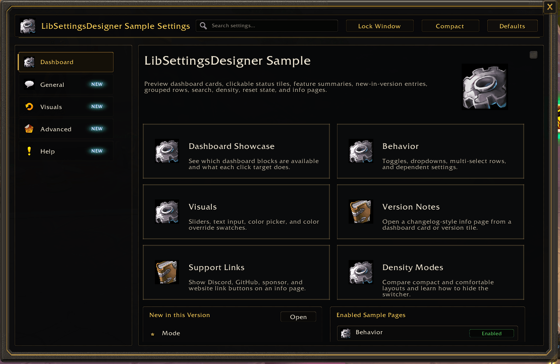
Dashboard Cards and Status Tiles
The dashboard includes clickable cards for important pages such as Behavior, Visuals, Version Notes, Support Links, Density Modes, and Editor Extensions. It also includes status tiles for customized settings, new entries, version notes, and shortcut counts.
User impact: important settings are reachable without digging through category trees. The dashboard shows how users can land on the most relevant pages quickly and how live status values can guide them toward changed or new settings.
Search and New-Feature Badges
The sample includes searchable labels, ids, keywords, notes, and tag:new behavior. New-feature metadata is shown in dashboard summaries and page/control badges.
User impact: users can find settings by common words such as scale, role, color, sound, shortcut, or new. Addon authors can see how search aliases and new badges reduce confusion after updates or renamed settings.
Behavior Controls
The Behavior page demonstrates common addon options:
- A main enable toggle.
- A mode dropdown.
- A multi-dropdown storing roles as a boolean selection map.
- A checkbox-dropdown that combines a boolean setting with a related channel choice.
- A sound dropdown with preview behavior.
- Hover notes that explain stored value shapes.
User impact: users can interact with common control types and understand how each setting stores data. Addon authors can copy the pattern for real toggles, modes, role filters, announcements, and sound choices.
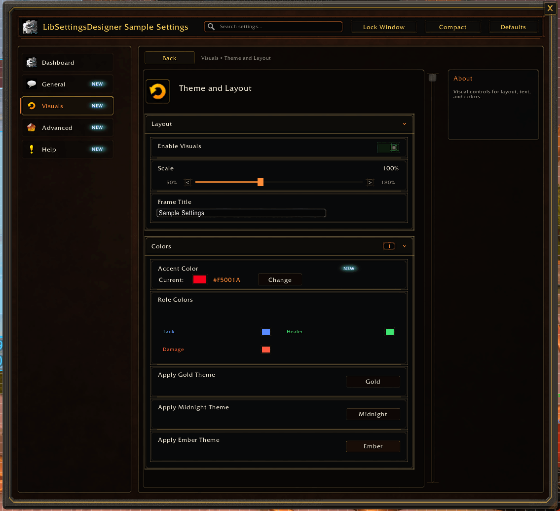
Visual Theme and Layout Controls
The Visuals page demonstrates:
- A feature toggle.
- A scale slider with percentage formatting.
- A text input for a frame title.
- A color picker for a single accent color.
- A color palette for multiple role colors.
- Buttons that apply predefined theme presets.
User impact: users can see immediate examples of layout and color customization. Addon authors can inspect how to expose visual settings while keeping defaults, reset behavior, and saved values predictable.
Editable Lists and Dynamic Editors
The sample includes reorder-list examples for broker columns, custom groups, and shortcuts. Rows can be moved, toggled, added, removed, and formatted. It also includes a custom hosted editor page to show how a host addon can render specialized UI inside the settings center.
User impact: users can test more advanced settings patterns that go beyond simple checkboxes. Addon authors can see how to build editable lists, ordered layouts, and custom editor pages without giving up the library-owned frame, search, navigation, and lifecycle handling.
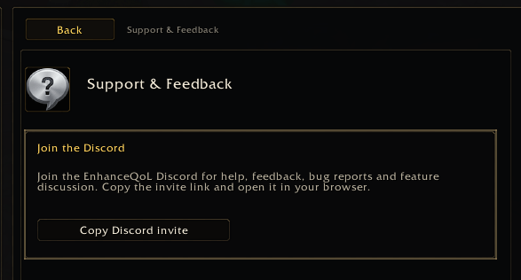
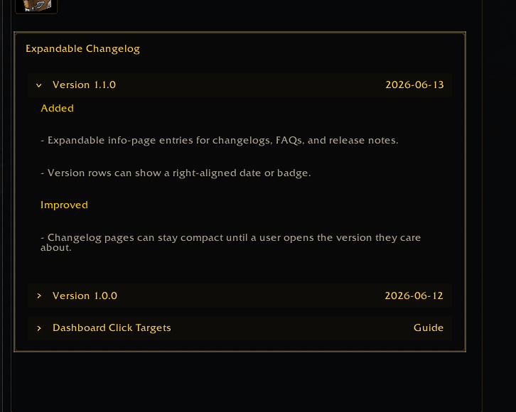
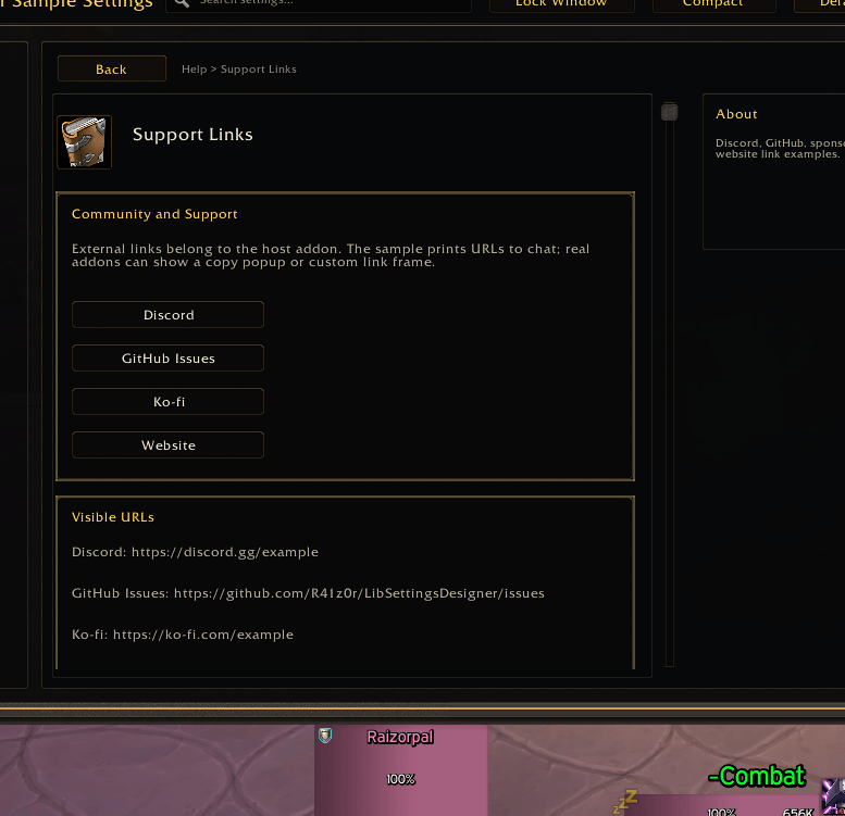
Info Pages, Changelog Sections, and Support Links
The Help category includes static info pages, expandable changelog entries, command references, support-link buttons, and visible URL text.
User impact: users can read help, version notes, and support information inside the same settings window. Addon authors can see how to present documentation, release notes, FAQs, and support links without building a separate help UI.
Compact and Comfortable Density Modes
The sample demonstrates compact and comfortable row density. The selected density can be persisted in SavedVariables.
User impact: users can choose between denser information for quick scanning and roomier rows for readability. Addon authors can decide whether to expose density switching or lock a fixed layout for their addon.
Customized Counters and Reset Behavior
Changed values update customized counters in the dashboard, sidebar, pages, and groups. The sample includes reset behavior so users can return values to defaults.
User impact: users can understand what they changed and recover from experimentation. Addon authors can verify how defaults and current values affect customized-state reporting.
Window Size and Lock Persistence
The sample stores settings-window size, lock state, and density under its SavedVariables profile.
User impact: the settings center remembers the user's preferred layout between sessions. Addon authors can see a practical pattern for persisting frame preferences without mixing those preferences into feature logic.
What LibSettingsDesigner Demonstrates
LibSettingsDesigner turns structured metadata into a rendered settings UI. A host addon registers categories, pages, groups, controls, defaults, getters, setters, visibility rules, search metadata, dashboard cards, and info pages. The library then renders the frame, sidebar, dashboard, controls, notes, search results, reset state, density controls, and open/toggle helpers.
This sample demonstrates that model with real in-game data and real saved variables. It shows how a host addon can keep feature logic in its own files while letting LibSettingsDesigner handle the reusable settings-center experience.
Who Should Install This Addon
Install this sample if you:
- Build World of Warcraft addons and want a working LibSettingsDesigner reference.
- Want to inspect dashboard, search, notes, controls, and reset behavior in game.
- Need examples for dropdowns, multi-dropdowns, color controls, reorder lists, and custom hosted pages.
- Want to verify how a vendored settings library behaves before adding it to your own addon.
Regular players can also install it safely as a UI preview. It does not automate gameplay, modify combat behavior, or require another addon.
Important Notes
- This is a sample and reference addon, not a gameplay feature addon.
- LibSettingsDesigner is vendored per addon and is not registered through LibStub.
- The sample includes its own vendored runtime copy under
libs/LibSettingsDesigner.
- The actual library source and documentation are maintained at:
https://github.com/R41z0r/LibSettingsDesigner
Summary
LibSettingsDesigner Sample gives users and addon authors a detailed, interactive preview of a full addon settings center. It shows how dashboard navigation, searchable settings, common controls, advanced editors, info pages, support links, changelogs, density modes, reset behavior, and persistent window preferences affect the user experience in practice.


