LibIconPicker
- By
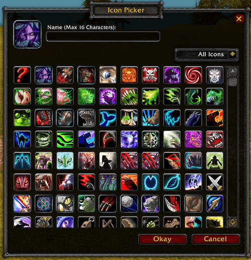
LibIconPicker is a reusable load-on-demand library that provides a flexible icon chooser dialog with callback support for addon developers.

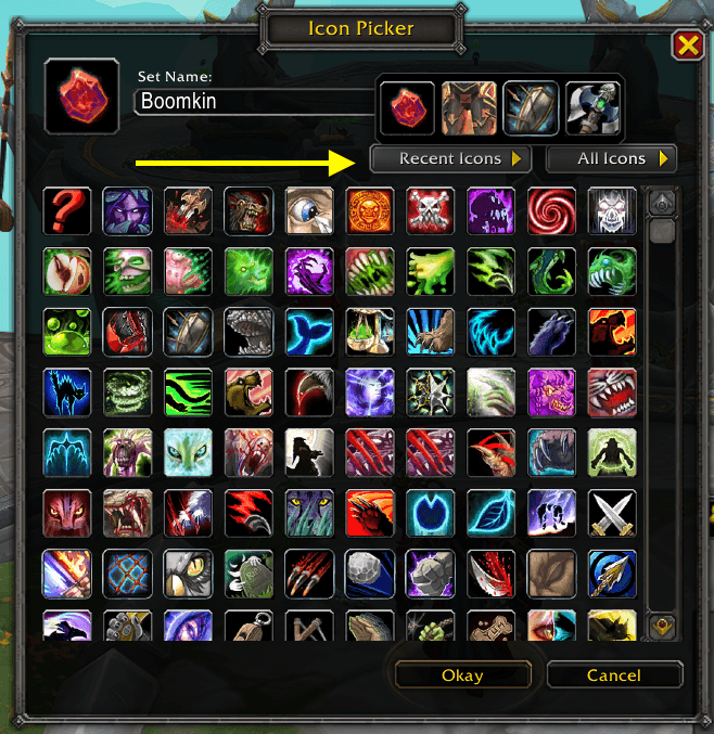
The Recent Icons dropdown next to the icon filter shows your last 15 confirmed picks as a grid.
Description
> Every icon in Azeroth, one click away.
LibIconPicker is a high-performance icon selection library for World of Warcraft addons. It provides a clean, callback-based API that lets addons open an icon picker and receive the selected icon instantly — without managing UI state, layouts, or large icon lists themselves.
What's New
https://www.youtube.com/watch?v=UNbEz77MG2c
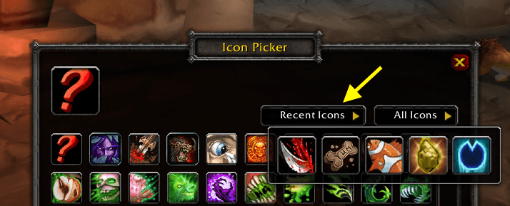
Recent Icons
Reuse an icon without hunting for it again: the Recent Icons dropdown next to the icon filter shows your last 15 confirmed picks as a grid. Click one to select it, then click Okay. Your recent icons are remembered across sessions when LibIconPicker is installed standalone, and for the current session when embedded. A one-time tip points the dropdown out. Addons that use LibIconPicker get this automatically, with no API changes.
Drag and drop Icon from anywhere
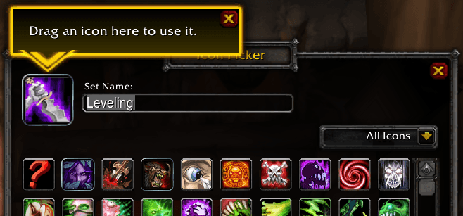
Set an icon without searching the grid: drag an item from your bags, a spell from your spellbook, or a macro, mount, battle pet, or equipment set onto the selected icon, then click Okay. The selected icon highlights while you hold something it accepts, and a one-time tip points it out the first time the picker opens. Addons that use LibIconPicker get this automatically, with no API changes.
Designed from the ground up to be lightweight and efficient, LibIconPicker uses a hybrid scroll frame and lazy rendering so only visible icons are processed at any time. This keeps CPU usage low during scrolling and filtering, even with very large icon sets, and avoids unnecessary redraws or background work.
The UI is lazy-loaded and initialized only when needed, ensuring minimal memory usage and zero impact on addon startup time. No persistent data or saved variables are created by the library, keeping memory footprints small and predictable.
LibIconPicker is designed to load on-demand, supports multiple addons simultaneously, and avoids global side effects by following established WoW library conventions. The result is a fast, scalable, and memory-efficient icon picker that integrates cleanly into any addon without adding performance overhead or maintenance burden.
LibIconPicker is NOT SAFE TO EMBED due to global XML frame names in the addon xml files.
Usage
The following example loads LibIconPicker on demand (if not already loaded) before invoking its public API. See the use cases for complete integration patterns and how this library can be leveraged by consumer addons.
local LoadAddOn     = LoadAddOn or C_AddOns.LoadAddOn
local IsAddOnLoaded = IsAddOnLoaded or C_AddOns.IsAddOnLoaded
local addOnName     = 'LibIconPicker'
local loaded, msg   = IsAddOnLoaded(addOnName), nil
if not loaded then
    loaded, msg = LoadAddOn(addOnName)
    if not loaded then
        return print('Failed to load LibIconPicker, msg:', msg)
    end
end
LibIconPicker:Open(function(sel)
    print('Selected icon:', sel.icon)
end)
API Definition
Full Documentation is here:
The public interface definition is here with EmmyLua annotations
LibIconPicker_Options
--- @type LibIconPicker_Options
local opt = {
    icon = 123, --[[ @as number ]]
    showTextInput = true, --[[ @as boolean ]]
    -- @type LibIconPicker_TextInputOptions
    textInput = { label = 'Enter Name:', value = 'Uber Spell' },
    -- @type LibIconPicker_Anchor
    anchor = {
        point = 'TOPRIGHT',
        relativeTo = UIParent,
        relativePoint = 'TOPRIGHT',
        x = -50,
        y = -100
    },
}
Callback: LibIconPicker_CallbackFn
--- @param sel LibIconPicker_Selection
function callbackFn(sel)
    -- sel.icon           : The user selected icon
    -- sel.textInputValue : The user text input value
end
Usage Example
Show icon picker with textInput and anchor
--- @type LibIconPicker_Options
local opt = {
    showTextInput = true,
    anchor = {
        point = 'TOPRIGHT',
        relativeTo = UIParent,
        relativePoint = 'TOPRIGHT',
        x = -50,
        y = -100
    },
}
--- @param sel LibIconPicker_Selection
LibIconPicker:Open(function(sel)
    print('Selected icon:', sel.icon, ' user-input-text:', sel.textInputValue)
end, opt)
Close the Icon Picker
LibIconPicker:Close()General Comments
Drop your commments/questions here.
Donations
If LibIconPicker has made your addon development easier, consider supporting its development:
About
- About the Author (Tony Lagnada)
- My AddOn Portfolio Can Be Found Here Curse Forge/Kapresoft
LibIconPicker Team

Owner