
A rounded corner panel.
These are widgets automatically built by the framework. The user provides a table with instructions, and the framework builds them.
A window displaying a simple 90-degree corner panel with scroll boxes, buttons, text labels, sliders, checkboxes, dropdown menus, text fields, and subpanels.
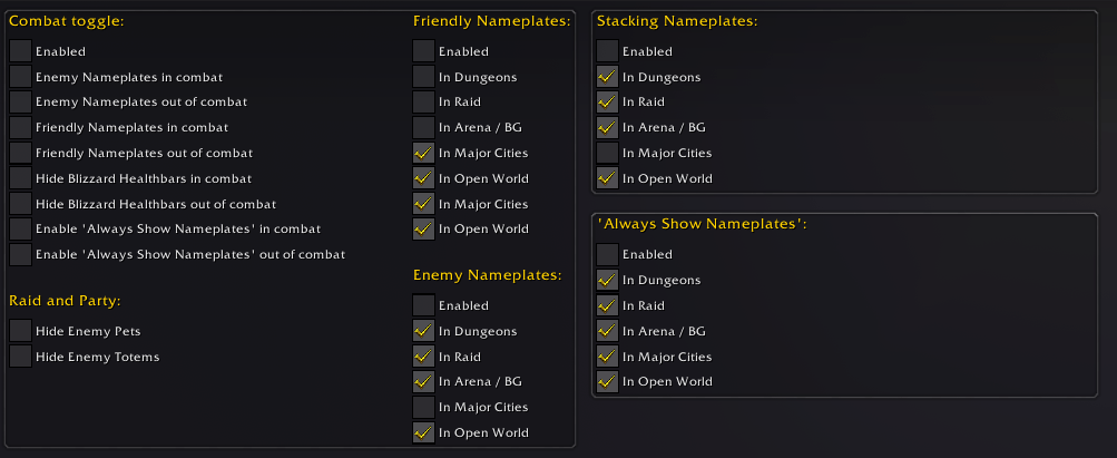
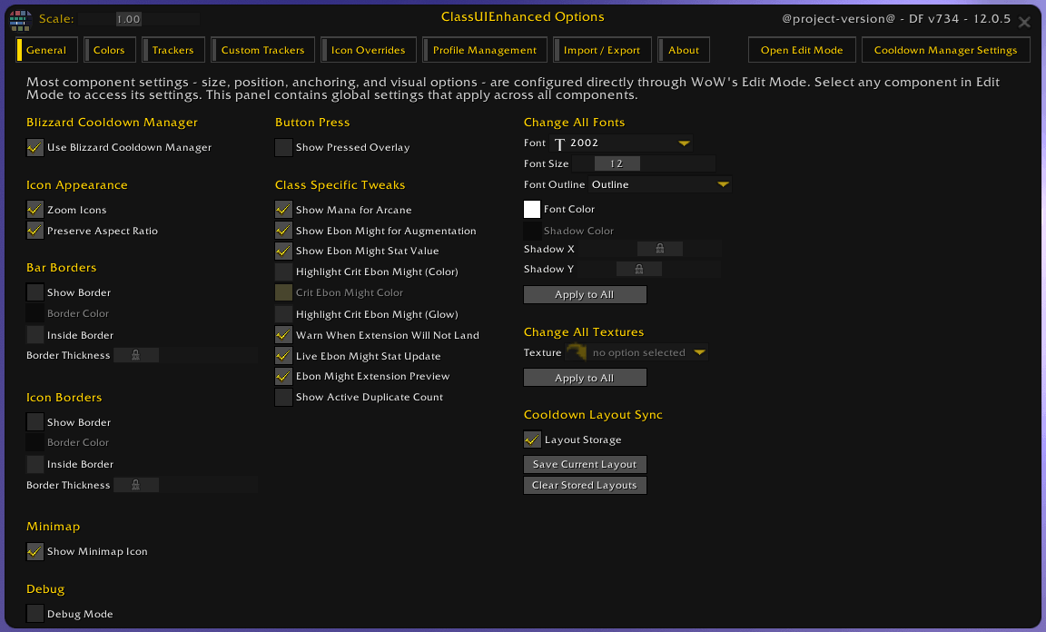
A settings window with options organized into visually separated group panels, each enclosed by bordered background frames to improve structure and readability.
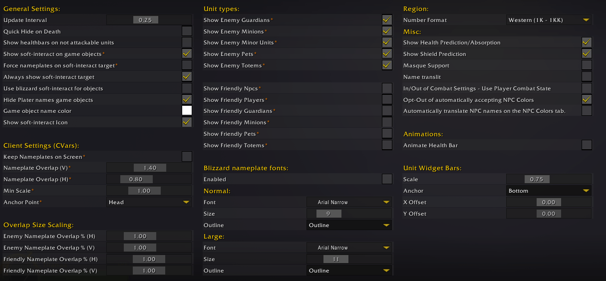
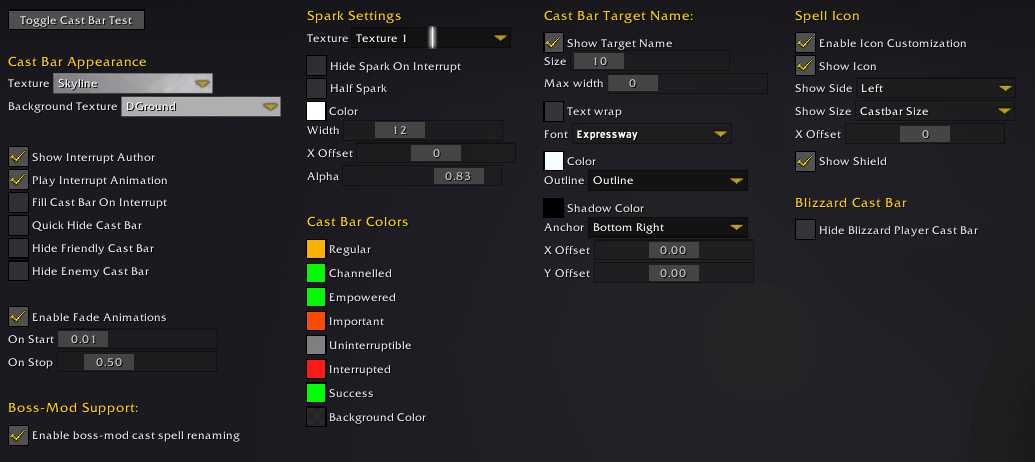
An options panel organized into equally sized columns, with setting labels on the left and controls or values on the right. The consistent layout creates a cleaner, more structured, and formal interface.
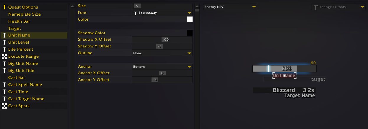
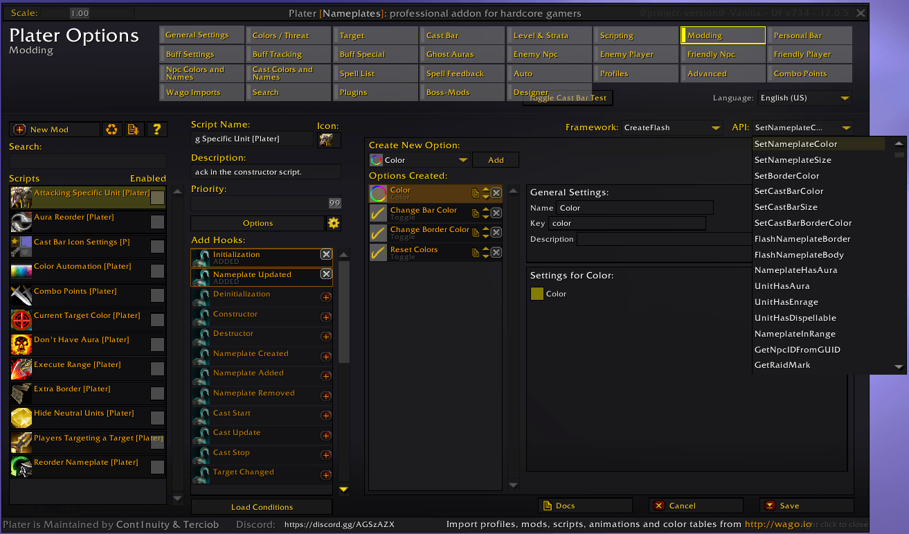
The editor panel features a frame divided into three sections: a widget selector on the left, an options panel in the center, and a real-time preview on the right. Users can click preview elements directly, reducing the need to search through option lists.
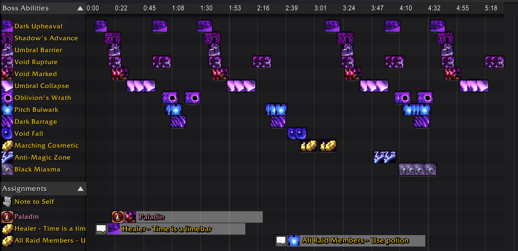
The timeline component features a left-side header listing spell names, a central time grid displaying event blocks based on when they occur, and an elapsed time bar component at the top providing temporal reference across the timeline.
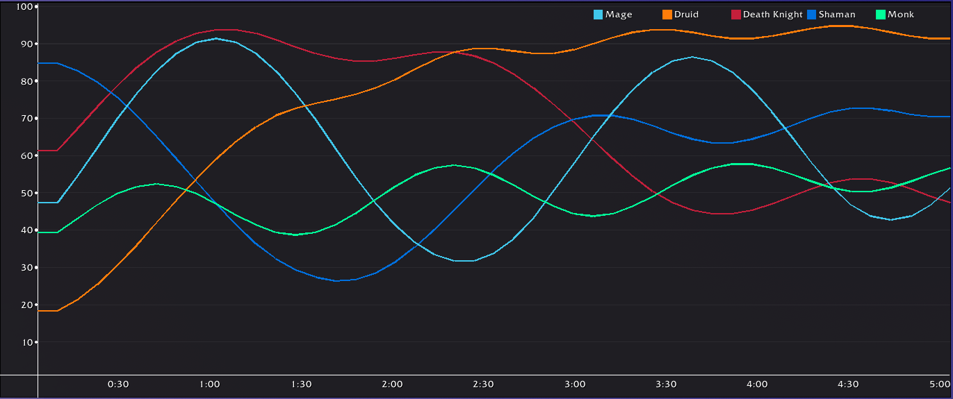
Chart / graphic module where the user can create line charts to show data for the player.
5 frames inside a container, the thick gray horizontal and vertical lines are resizers, they can be dragged to reduce or increase the size of the frames inside. The resize bar can also be hidden to lock the frames size.
Game Cooltip is an alternative tooltip framework to Blizzard’s GameTooltip. It supports both standard tooltips and interactive menu-style popups.