ModernTabs
- By
A standalone, cross-platform library that makes creative mode tabs more customizable
What is ModernTabs?
It is a library mod that adds a cross-platform solution for customzing any creative tab even further than what is currently possible on both NeoForge and Fabric.
ModernTabs makes it possible to add individual sections with an assigned banner, change the scrollbar sprite and modify the background sprite for the creative tab icon. Furthermore, you can use any sprite as a creative tab icon without it having to be registered as an item in game.
ModernTabs also makes it possible to change the background, icon background and scroller texture just by defining the color you want without any texture sprite required.
The idea for the creative tab banners comes from the Create Aeronautics/Simulated mod and therefore includes little portions of its code.
There is also a KubeJs integration since version v1.5.0 for Modpack devolopers. If you want to see more regarding how to implement specific things via KubeJs, scroll down a little under the For Modpack Developers section.
Showcase - Example Creative Tab
Many different new design options!
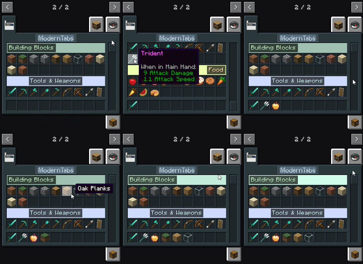
This example creative tab is only enabled in the development enviroment and therefore exists for showcase only.
That means it will not show up in a regular modpack.
For Mod Developers
How to use ModernTabs in your own mod (Setup):
You have to define this in your build.gradle file:
repositories {
    maven {
        name = "Jitpack"
        url 'https://jitpack.io'
    }
}

dependencies {
  // Only required in a multiloader setup (use this in your common part of your mod)
  // contains the common module
  modImplementation("com.github.Roboter007.ModernTabs:ModernTabs-common:${rootProject.moderntabs_version}")

  // Required on Fabric
  // contains the Fabric specific module including the common module
  modImplementation("com.github.Roboter007.ModernTabs:ModernTabs-fabric:${rootProject.moderntabs_version}")

  // Required on NeoForge
  // contains the NeoForge specific module including the common module
  modImplementation("com.github.Roboter007.ModernTabs:ModernTabs-neoforge:${rootProject.moderntabs_version}")
}
Then you can define this in your gradle.properties file:
// for the latest version:
moderntabs_version=v1.6.2
What you need to do in order to correctly customize creative tabs with your mod:
// The TabIconBackground class combines any possible state of the tab icon background
// It uses the default vanilla sprite if it doesn't find a sprite in the given location
// the sprites for the icon background has to be located under textures/gui/sprites/creative_inventory/
// the sprite file for the icon background depends on: tab_tabIdentifer_row_column_selectionState.png
// example file name: tab_example_top_left_selected.png
TabIconBackground exampleTabBackgrounds = new TabIconBackground(ExampleMod.MOD_ID, "example"); // example is the tabIdentifier

// in this example the first argument represents the text background color
// the second argument defines the location of the sprite file and the third and fourth defines the rendered width and height of the example_titel.png
// the sprite file has to be in the sprites folder (in this example under: textures/gui/sprites/creative_inventory/example_titel.png)
SpriteTabTitel spriteTabTitel = new SpriteTabTitel()
                       // the location of the titel sprite
                       .spriteTabTitelLocation(ResourceLocation.fromNamespaceAndPath(ExampleMod.MOD_ID, "container/creative_inventory/example_titel"))
                       // the background color
                       .backgroundColor(new ModernColor("#36454F").lighten(0.5f))
                       // sprite width
                       .width(64)
                       // sprite height
                       .height(10);

// just an example color
ModernColor exampleColor = new ModernColor("#36454F");

// create a new tab design
TabDesign tabDesign = new TabDesign()
        // makes it possible for the defined creative tab to use custom sections
        .sectionsEnabled(true)
        // changes the tab icon background sprite in any given state
        .tabIconBackground(exampleTabBackgrounds)
        // displays a sprite instance of an regular Minecraft item.
        // the sprite for the custom icon has to be located under textures/gui/sprites/
        .tabIconLocation(ResourceLocation.fromNamespaceAndPath(ExampleMod.MOD_ID, "example_icon"))
        // changes the sprite for the scrollbar
        // the scrollbar for the custom icon has to be located under textures/gui/sprites/
        .tabScrollerLocation(ResourceLocation.fromNamespaceAndPath(ExampleMod.MOD_ID, "example_scroller"))
        // modifies your creative tab titel
        // options: 1) aura text style (equivalent to the text of the creative tab banners)
        //          2) sprite (uses a sprite as your creative tab titel)
        //          3) custom (uses the default vanilla style text rendering, but with more configuration options like the text color)
        .customTabTitel(spriteTabTitel)
        // sets only the creative tab background texture color and the scrollbar texture color
        .backgroundColor(exampleColor)
        // this method combines the backgroundColor method and the tabIconBackground method, so you can color the whole tab in a single method call
        .color(exampleColor);

// use your already registered creative tab (in this example: EXAMPLE_TAB)
ModernTabs.configureTab(EXAMPLE_TAB, tabDesign);

// this defines which items are included in which section
// for creating a section you need to define a json file in your assets folder (scroll down a little, if you want to know how create a section)
SectionedItems.addItem(ResourceLocation.fromNamespaceAndPath(ExampleMod.MOD_ID, "example_section"), ExampleItems.EXAMPLE_ITEM);

// hide a debug item from the grid but keep it searchable
TabItemTransforms.setVisibility(MyItems.DEBUG_STICK, TabItemTransforms.VisibilityType.SEARCH_ONLY);
In order for the creative tab sections to work properly, you need to create one JSON file for each creative tab section you want to have.
These json files have to be in the location: assets/mymod/moderntabs/sections/example_section.json and the defined section in your code has to match one json file in this location.
Example JSON file:
{
  "priority": 0,
  "title": {
    "text": { "translate": "itemGroup.examplemod.basics" },
    "color": "#FFFFFF",
    "background": "#AA000000"
  },
  "banner": {
    "sprite": "examplemod:example_banner",
    "animation_mode": "play_on_hover",
    "color": "#D1FF03"
  },
  "overlay": {
    "sprite": "moderntabs:overlay/default_banner_overlay",
    "animation_mode": "not_animated",
    "color": "#D1FF03"
  }
}
| Field | Type | Default | Notes |
|---|---|---|---|
priority |
positive int | 0 (optional) |
Lower values are drawn first (higher up in the tab). |
title.text |
Component | no default (required) |
Any normal text/translatable component. |
title.color |
any html color code:"#RRGGBB""#AARRGGBB" |
#FFFFFFFF (optional) |
Primary text fill color. |
title.secondary_color |
any html color code:"#RRGGBB""#AARRGGBB" |
20% darker than title.color (optional) |
Outline/"aura" color. |
title.background |
any html color code: |
#AA000000 (optional) |
Background color of the pill behind the text. |
title.orientation |
TextOrientation | left (optional) |
Defines if the text gets placed left, centered or right on the banner |
banner.sprite |
sprite ID as a string | moderntabs:colored_banner or moderntabs:missing_banner (optional if a color is defined) |
A texture under |
| banner.color | any html color code:"#RRGGBB""#AARRGGBB" |
#FFFFFFFF (optional) |
Defines a color that the rendered sprite should be rendered in |
banner.animation_mode |
BannerAnimationMode | not_animated (optional) |
Defines how the banner animation gets treated. Possible inputs are: not_animated, play_on_hover, play_continuously |
| overlay.sprite | sprite ID as a string | moderntabs:overlay/default_banner_overlay(optional) |
A texture under textures/gui/sprites/, 162×18 px per animation frame. This is different to the banner as this sprite gets rendered on top of the main banner sprite/image |
| overlay.color | any html color code:"#RRGGBB""#AARRGGBB" |
#FFFFFFFF (optional) |
Defines a color that the rendered sprite should be rendered in |
| overlay.animation_mode | BannerAnimationMode | not_animated (optional) |
Defines how the banner animation gets treated. Possible inputs are: not_animated, play_on_hover, play_continuously |
For Modpack/KubeJs Developers
How to use ModernTabs in your own mod (Setup):
At first, download the latest KubeJs and ModernTabs version.
What you need to do in order to correctly customize the creative tabs you want to modify:
You can simply create a new JavaScript/js file in the startup_scripts folder. This code can be used as an orientation:
// The TabIconBackground class combines any possible state of the tab icon background
// It uses the default vanilla sprite if it doesn't find a sprite in the given location
// the sprites for the icon background has to be located under textures/gui/sprites/creative_inventory/
// the sprite file for the icon background depends on: tab_tabIdentifer_row_column_selectionState.png
// example file name: tab_example_top_left_selected.png
const exampleTabBackgrounds = new TabIconBackground("examplemod", "example"); // example is the tabIdentifier

// in this example the first argument represents the text background color
// the second argument defines the location of the sprite file and the third and fourth defines the rendered width and height of the example_titel.png
// the sprite file has to be in the sprites folder (in this example under: textures/gui/sprites/creative_inventory/example_titel.png)
const spriteTabTitel = new SpriteTabTitel()
                       // the location of the titel sprite
                       .spriteTabTitelLocation("examplemod:container/creative_inventory/example_titel")
                       // the background color
                       .backgroundColor(new ModernColor("#36454F").lighten(0.5))
                       // sprite width
                       .width(64)
                       // sprite height
                       .height(10);

// just an example color
const exampleColor = new ModernColor("#36454F");

// create a new tab design
const tabDesign = new TabDesign()
        // makes it possible for the defined creative tab to use custom sections
        .sectionsEnabled(true)
        // changes the tab icon background sprite in any given state
        .tabIconBackground(exampleTabBackgrounds)
        // displays a sprite instance of an regular Minecraft item.
        // the sprite for the custom icon has to be located under textures/gui/sprites/
        .tabIconLocation("examplemod:example_icon")
        // changes the sprite for the scrollbar
        // the scrollbar for the custom icon has to be located under textures/gui/sprites/
        .tabScrollerLocation("examplemod:example_scroller")
        // modifies your creative tab titel
        // options: 1) aura text style (equivalent to the text of the creative tab banners)
        //          2) sprite (uses a sprite as your creative tab titel)
        //          3) custom (uses the default vanilla style text rendering, but with more configuration options like the text color)
        .customTabTitel(spriteTabTitel)
        // sets only the creative tab background texture color and the scrollbar texture color
        .backgroundColor(exampleColor)
        // this method combines the backgroundColor method and the tabIconBackground method, so you can color the whole tab in a single method call
        .color(exampleColor);

// use your already registered creative tab (in this example: EXAMPLE_TAB)
ModernTabs.configureTab("examplemod:example_tab", tabDesign);

// this defines which items are included in which section
// for creating a section you need to define a json file in your assets folder (scroll down a little, if you want to know how create a section)
SectionedItems.addItem("examplemod:example_section", "examplemod:example_item");
In order for the creative tab sections to work properly, you need to create one JSON file for each creative tab section you want to have.
These json files have to be in the location: assets/mymod/moderntabs/sections/example_section.json and the defined section in your code has to match one json file in this location.
Example JSON file:
{
  "priority": 0,
  "title": {
    "text": { "translate": "itemGroup.examplemod.basics" },
    "color": "#FFFFFF",
    "background": "#AA000000"
  },
  "banner": {
    "sprite": "examplemod:example_banner",
    "animation_mode": "play_on_hover",
    "color": "#D1FF03"
  },
  "overlay": {
    "sprite": "moderntabs:overlay/default_banner_overlay",
    "animation_mode": "not_animated",
    "color": "#D1FF03"
  }
}
| Field | Type | Default | Notes |
|---|---|---|---|
priority |
positive int | 0 (optional) |
Lower values are drawn first (higher up in the tab). |
title.text |
Component | no default (required) |
Any normal text/translatable component. |
title.color |
any html color code:"#RRGGBB""#AARRGGBB" |
#FFFFFFFF (optional) |
Primary text fill color. |
title.secondary_color |
any html color code:"#RRGGBB""#AARRGGBB" |
20% darker than title.color (optional) |
Outline/"aura" color. |
title.background |
any html color code: |
#AA000000 (optional) |
Background color of the pill behind the text. |
title.orientation |
TextOrientation | left (optional) |
Defines if the text gets placed left, centered or right on the banner |
banner.sprite |
sprite ID as a string | moderntabs:colored_banner or moderntabs:missing_banner (optional if a color is defined) |
A texture under |
| banner.color | any html color code:"#RRGGBB""#AARRGGBB" |
#FFFFFFFF (optional) |
Defines a color that the rendered sprite should be rendered in |
banner.animation_mode |
BannerAnimationMode | not_animated (optional) |
Defines how the banner animation gets treated. Possible inputs are: not_animated, play_on_hover, play_continuously |
| overlay.sprite | sprite ID as a string | moderntabs:overlay/default_banner_overlay(optional) |
A texture under textures/gui/sprites/, 162×18 px per animation frame. This is different to the banner as this sprite gets rendered on top of the main banner sprite/image |
| overlay.color | any html color code:"#RRGGBB""#AARRGGBB" |
#FFFFFFFF (optional) |
Defines a color that the rendered sprite should be rendered in |
| overlay.animation_mode | BannerAnimationMode | not_animated (optional) |
Defines how the banner animation gets treated. Possible inputs are: not_animated, play_on_hover, play_continuously |
FAQ
Why another such mod that adds creative tab banners?
➔ I created this library so I can use it for some upcoming mods by me and therefore, I need both a supported NeoForge and Fabric version.
Additionly, it already contains many other features with the goal of making the creative tab easier to configure.
Will the Minecraft version x be supported?
➔ I will not backport it. If anyone plans on doing it, feel free to do it and if you want, you can create a pull request on GitHub. I might update it to newer versions in the future (but I will not guarantee it).
Bugs & Feature Requests
Please report any bugs you encounter or feature requests on the linked GitHub.
Credits
- Thank you to the Create Aeronautics/Simulated mod team and contributors for creating such a great mod.
The ModernTabs Team