


Bubblify - Chat Bubbles
- By
Captura de tela 2026-11-04 155845.png
Captura de tela 2026-11-04 161003.png
2026-11-04_16.01.38.png
2026-11-04_15.57.05.png
Description
💬 Bubblify — Immersive Chat Bubbles
Bring conversations into the world.
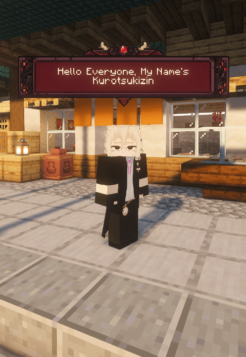
Bubblify transforms how players communicate in Minecraft by displaying chat messages in floating speech bubbles above their characters.
Originally designed for survival servers and roleplay communities, the mod brings attention back to the world around you instead of keeping every conversation in the corner of the screen.
Whether you are gathering around a campfire, exploring with friends, or taking part in a narrative event, Bubblify gives conversations a visual presence. 🏕️
⊰═══════════════════════════════════════════════⊱
✨ Key Features
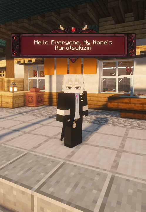
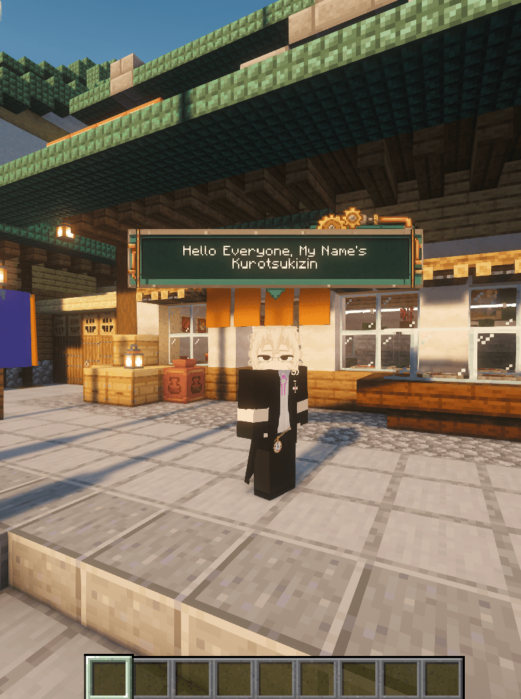
- 💬 In-World Speech Bubbles — Messages appear above players and follow their movement, making it easier to identify who is speaking.
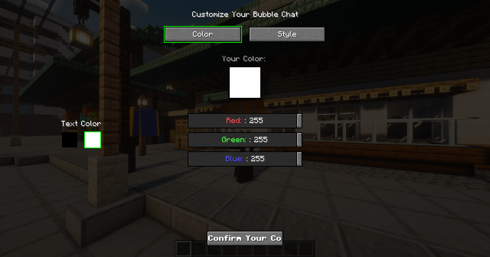
- 🎨 RGB Background Customization — Personalize the default bubble’s background using the in-game RGB color picker.
- 🖤 Black or White Text — Choose the text color that best contrasts with your bubble design.
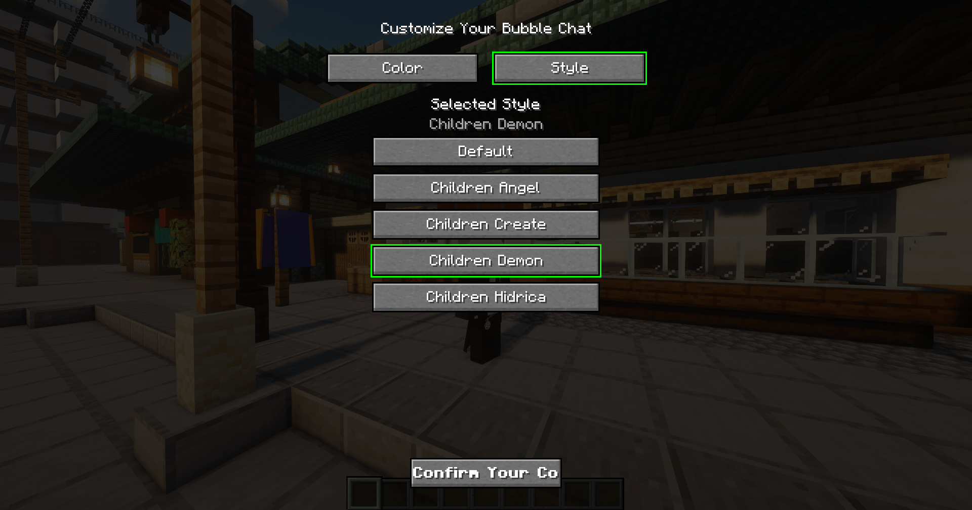
- 🖼️ Custom Bubble Styles — Create designs using separate textures for the upper decoration, message panel, and tail.
- 📚 Organized Conversations — Messages support stacking and automatic line wrapping.
- 💾 Saved Color Preferences — Your selected color is saved locally, so you do not need to configure it every time you play.
- 🎭 Narrative Roles — Support roleplay events with designated NPC and Children roles.
- 🔐 Style Permissions — Control access to custom bubble styles through the server’s permission system.
⊰═══════════════════════════════════════════════⊱
🎭 Built for Roleplay and Immersion
Give your characters a voice that feels connected to the scene.
Bubblify complements town conversations, quest interactions, community events, and story-driven adventures by helping players see who is speaking.
Customize your bubble designs to match your server’s characters, atmosphere, and visual identity. ✨
⊰═══════════════════════════════════════════════⊱
📁 Setting Up Custom Bubble Styles
Custom styles are organized inside your server’s config folder.
1️⃣ Create the Main Folder
Open your server’s files, locate the config folder, and create a folder named bubblifymod.
Inside it, create:
- A file named
config.json. - A folder named
styles.
Your structure should look like this:
config/
└── bubblifymod/
    ├── config.json
    └── styles/
2️⃣ Configure config.json
Open config.json and insert:
{
  "defaultStyleId": "default"
}
This example keeps default as the configured default style ID.
3️⃣ Create Your Style Folder
Inside styles, create a separate folder for each custom bubble.
For this tutorial, the example style is named children_demon:
config/
└── bubblifymod/
    ├── config.json
    └── styles/
        └── children_demon/
            ├── style.json
            ├── superior.png
            ├── painel.png
            └── cauda.png
📌 Each custom style should have its own folder, configuration file, and textures.
📄 Make sure the configuration is saved as style.json, not style.json.txt.
⊰═══════════════════════════════════════════════⊱
🖼️ Creating the PNG Textures
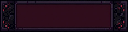
Each style uses three PNG images:
- 👑
superior.png— the upper decoration. - 💬
painel.png— the main background behind the message. - 🔻
cauda.png— the speech bubble’s tail.
📐 Example Image Sizes
For a first design, you can use:
superior.png → 80 × 16 pixels
painel.png   → 128 × 42 pixels
cauda.png    → 16 × 8 pixels

🎨 Texture Tips
- Use PNG transparency around decorative shapes where needed.
- Keep enough space inside the panel for readable text.
- Match the filenames in
style.jsonto the actual image filenames. - Set
sourceWidthto the actual width ofpainel.png. - The top and tail dimensions describe their cropped areas. Extra transparent margins can make the complete PNG larger than these areas.
💡 For your first style, use the example dimensions without extra transparent margins on the top and tail.
⊰═══════════════════════════════════════════════⊱
📝 Creating style.json
Inside your style folder, create style.json and paste the following:
{
  "id": "children_demon",
  "displayName": "Demon",
  "category": "CHILDREN",

  "top": "superior.png",
  "body": "painel.png",
  "tail": "cauda.png",

  "sourceWidth": 128,
  "bodyHeight": 42,

  "panelAspectRatio": 3.0,
  "maxTextWidth": 64,

  "topWidth": 80,
  "topHeight": 16,
  "topAlign": 0.5,
  "topOffsetX": 0,
  "topInset": 7,

  "tailWidth": 16,
  "tailHeight": 8,
  "tailAlign": 0.5,
  "tailOffsetX": 0,
  "tailInset": 4,

  "paddingLeft": 16,
  "paddingRight": 16,
  "paddingTop": 7,
  "paddingBottom": 7,

  "heightOffset": 2.1,
  "fullBright": true,

  "stackMode": "shared",
  "panelGap": 0,
  "uniformPanelWidth": true
}
⊰═══════════════════════════════════════════════⊱
⚙️ Understanding the Style Configuration
🏷️ Style Identity
id— internal identifier for the style. Give each style a distinct ID.displayName— name assigned to the style for display.category— category assigned to the style. This example usesCHILDREN.
🧩 Texture Filenames
top— upper decoration image.body— main message panel image.tail— speech bubble tail image.
The filenames must match the PNG files inside the style folder.
📏 Main Panel Settings
sourceWidth— original width of the body texture, in pixels. It must match the actual width ofpainel.png.bodyHeight— usable panel height before the tail, in pixels.panelAspectRatio— intended width-to-height ratio; not currently applied.maxTextWidth— intended text width before wrapping; not currently applied.
👑 Upper Decoration Settings
topWidth— width of the cropped upper decoration.topHeight— height of the cropped upper decoration.topAlign— horizontal alignment.topOffsetX— additional horizontal adjustment.topInset— inset adjustment for the upper decoration, in pixels.
Alignment values:
0.0 → Left
0.5 → Center
1.0 → Right
For topOffsetX, negative values move the decoration left and positive values move it right.
🔻 Tail Settings
tailWidth— width of the cropped tail.tailHeight— height of the cropped tail.tailAlign— horizontal alignment, using the same values astopAlign.tailOffsetX— additional horizontal adjustment.tailInset— inset adjustment for the tail, in pixels.
📝 Text Padding
These settings define the space between the panel’s edges and the message:
paddingLeftpaddingRightpaddingToppaddingBottom
Increase the corresponding padding when your artwork needs more room around the text.
💡 Height and Lighting
heightOffset— fine height adjustment. Accepts positive or negative values.fullBright—truekeeps the text fully bright;falseuses normal lighting.
📚 Message Stacking
stackMode—"shared"uses a shared panel for consecutive messages.panelGap— space between stacked panels, in pixels.uniformPanelWidth— whentrue, stacked messages use the largest width in the stack.
⊰═══════════════════════════════════════════════⊱
🎨 Adding More Styles
To create another bubble design:
- Create another folder inside
styles. - Add its three PNG textures.
- Add its own
style.json. - Give it a distinct
id. - Adjust the filenames, dimensions, and layout settings to match the artwork.
Example:
config/
└── bubblifymod/
    ├── config.json
    └── styles/
        ├── children_demon/
        │   ├── style.json
        │   ├── superior.png
        │   ├── painel.png
        │   └── cauda.png
        │
        └── another_style/
            ├── style.json
            ├── superior.png
            ├── painel.png
            └── cauda.png
🔐 Creating a style does not automatically grant every player access to it. Style availability also depends on the server’s permission system.
⊰═══════════════════════════════════════════════⊱
🛠️ Server Administration
Administrative commands require permission level 2 or higher.
💬 Chat Setting
Disable the chat setting:
/bubblify show_chat falseEnable it again:
/bubblify show_chat true
🎭 Narrative Roles
Assign the NPC role:
/bubblify class <player> npcAssign the Children role:
/bubblify class <player> childrenRemove a narrative role:
/bubblify class <player> clearReplace <player> with the target player’s name.

⊰═══════════════════════════════════════════════⊱
📦 Installation
Bubblify is required on both the client and the server for its multiplayer features.
- 🖥️ Client — Renders speech bubbles and provides the customization interface.
- 🌐 Server — Synchronizes multiplayer information and manages server-side settings.
Install the matching release on both sides, and check the supported Minecraft and Forge versions listed for the download.
⊰═══════════════════════════════════════════════⊱
💬 Every character has a voice. Give yours a bubble.
Bubblify - Chat Bubbles Team
